
Ad Disclosure
UniDiction 2011: Week 2 – Eagles vs. Falcons
By Dan Fuller
Published:
Look for me on Twitter (@dancfuller) where I'll likely have a few uniform-related updates during Sunday's games.
OK, so last week didn't go so well. Really, though, what kind of team (which has at least two perfectly suitable uniform options!) would choose to go out in their clownsuits, much less on kickoff Sunday?! For the sake of acting like this whole "UniDiction" thing isn't arbitrary, I'll point out my "score wraps to zero after 28" clause was in effect, so 31-13 became 3-13. I predicted Rams-Eagles 15-13. Ehh, nevermind – let's just say it didn't work out for me.
Nothing overwhelmingly noteworthy from the uniform front last week, though the Jaguars did combine White jersey with White pants, something they've never done with their current (2009 and later) uniform set.
Perhaps the biggest Eagles uniform news of the season broke on Friday, though. Per the official EaglesInsider twitter account, the Eagles will only wear their normal Green and White jerseys throughout the season. No Throwbacks and no Black alternates will be seen this year. Just the tried-and-true Green and White jerseys. Wearing alternate uniforms (especially throwbacks) is practically a license to print money, so who knows what the front office's motivations are for this move. Also, this tweet confirms they will only wear Green at home, unlike last year, where the White jerseys were worn at home during the warmer months to open the season. For completeness' sake, the Dolphins and Cowboys are "White at Home" teams, so the Green jerseys will be seen there. For completeness' sake's completeness' sake, this announcement also means the Eagles won't wear White in Philadelphia against the Cowboys to try invoke their Blue jersey curse.
Following up on a link I really pimped last week, the Gridiron Uniform Database actually updates during the games, so if you're interested in uniforms, it's fun geeky to check-in during the day to see which games have switched from blank template to fully illustrated. All of last week's match-ups at a glance.
Onward and upward (because it's bird-on-bird this week, you see)… we're in an odd spot this week. We're playing the Falcons, and lo-and-behold, we played them last year, too. But, you say, "Dan, the Eagles were home last year, surely you won't need to repeat last year's UniDiction verbatim." Unfortunately, last year, the Eagles chose to wear White over Green, regardless of the "home" nature of last year's game, so we're looking at a uniform re-match. I have more experience this year than I did Week 6 of 2010, so hit the jump, and let's do this thing.
Simply, the Falcons have one of those "modern for the sake of modern" uniforms. Unnecessary paneling, stripes that draw the wrong kind of attention to themselves, armpit highlighting, and an "angrified" update to a classic logo. (yes, the Eagles added 40% more ferocity with their 1996 logo refresh, but I'd be perfectly willing to have an internet argument with someone who thinks the Falcons' logo update is less shameless than the Eagles'.) Oddly, the Falcons used to be a bit more interesting from a uniform perspective, even with the current set. Instead of the current Throwback alternate, they had a Black alternate jersey in the mix as well as Black pants, allowing for all sorts of combinations, whether fortunate or unfortunate. Black over White (or vice versa) = good, Red over Black (or monochrome Black) = avert your eyes. For completists (and the person looking to participate in that internet argument, above), I'll point out that the Black jersey was actually the primary color jersey for 2003, the first season of these uniforms, with the Red as the alternate, but that got flip-flopped and stayed that way from 2004 until the 1966 throwbacks entered use in 2009 and replaced the Black alternates entirely. Here's my gallery of the various Falcons combinations. Also, keep in mind that some of those combinations haven't been seen for a while per the Gridiron Uniform Database.
The Falcons have announced their throwback dates, and they've decided that Sunday's primetime game against the Eagles wasn't worth it. Piecing together the Eagles Twitter announcement, the preview listing showing "Uniform: White," the fact that the Falcons' Black pants have been MIA since 2008, the Falcons will be in Red over White. Oddly, the Eagles preview lists "Uniform" only instead of separate "Jerseys" and "Pants" sections like usual, so let's (unfortunately) assume they're in…ugh… White over Green.
The UniDiction
Either 2, 3, 6, or 7 points awarded for each category (safety, field goal, touchdown, touchdown+point after)
Helmet
Eagles: 7 points —Metallic "Midnight" Green is second only to Kelly Green in the hearts of Philadelphia football fans (yes, that's a philosophically hollow statement — really, what are the other options? Penn State's Navy Blue? Unlikely). The wings are the kind of "functional" detail that really adds a lot of character to a helmet, much more than simply dumping the logo up there.
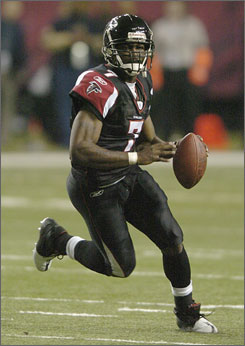
Falcons: 3 — Two big issues here and another interesting detail. 1) For the 2003 re-design, the designers did the "how can we make the current, widely recognized logo look meaner?" move, so increased stroke width, got rid of clean right-angles, and decorated some of the original logo's whitespace. (example: old logo is just white line art on a black field. The new logo is black and red with white stroke, then silver/grey stroke.) I will say that the mouth/head of the old logo was in desperate need of an update, so it's not a total loss. 2) In Black Helmets, the Falcons look like they should be wearing Black Jerseys. In Red Helmets, it looks like they should wear Red Jerseys. They don't always do this, especially with respect to the current jersey set and the current throwbacks. In one pretty cool detail, the Falcon on the current helmet makes an "F". Details never go unrewarded on Crossing Broad.
Jersey
Eagles: 6 — For some reason, I'm digging the White jersey more than normal this week. I guess I shouldn't hold the Green pants against it. I guess. We'll see how I feel when it shows up again.
Falcons: 1 — Are armpit highlighting features really necessary on a football jersey? Does adding a small patch of contrast color above the armpit area make it so it looks like an intentional design element, and not an armpit patch? No, it does not. Also, while they thankfully did not pick a "futuristic" typeface for the numbers, I generally prefer stroke to drop shadow. Also, see the helmet comments above about the mix-and-match nature of the helmet and jersey colors. Really, this Black Helmet/Black Jersey look is much better than the normal Black Helmet/Red Jersey combo.
Pants + Socks
Eagles: 2 — I really don't like these. The socks should be green, and the stripes on the pants aren't bright enough to offset the general, dour greenness of the pants.still don't like them. If they wear the White pants, change this score to a solid 6.
Falcons: 2 — OK, I'll admit that the fine line going down the hem of the left and right sides of the jersey, then meeting with identical lines on the pants is a nice touch. What isn't a nice touch is that that fine line morphs into a useless triangle of red and black at the knee. There's a difference between eschewing convention (such as using a fine line instead of thick stripes like more traditional uniforms), then there's just the false mindset that "modern = different for the sake of different."
Intangibles
Eagles: 2 — Even in White over Green, the Eagles will look better than the Falcons, but it's not a good look. The announcement that the Eagles won't be bringing out the Black alternates or the Throwbacks this year also hurts their score. Points also deducted for not electing to wear White at Home to get the Cowboys into their Blue jerseys. BUT, if the Eagles choose White pants for Sunday's game against the Falcons, bump this up to 6.
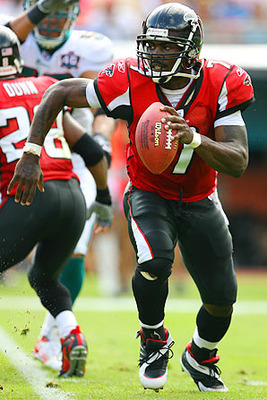
Falcons: 3 — The flying bird logo makes an "F!" Also, their throwbacks are spectacular, even if they're not going to be wearing them against the Eagles.
Final Score
Eagles 17
Falcons 9
Go Birds Eagles!
