

Phillies 4th of July Stars and Stripes Hats Unveiled
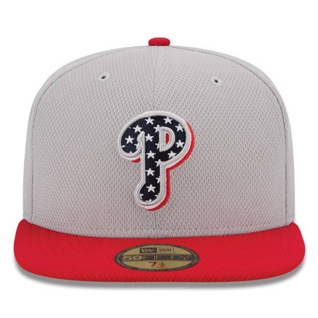
Staying true to their threat promise that there would be three different “Stars and Stripes” hats this year, the second iteration of the program was unveiled by New Era and the MLB today. I would expect a unique jersey will be paired with it, and purely guessing, I expect they will fill the Phillies lettering with the blue field of stars from the inside of the “P.”
Across the league, it’s the same design with either a blue or red brim and a white or grey crown depending on whether they’re home or away. They look like the “ice cream man” hats from the 2010 Stars and Stripes program.
They’re ugly, but I have to give them credit for being uniquely ugly compared to the Memorial Day camouflage hats. On the bright side, at least red is one of the Phillies colors, so it’s not like the A’s who will be mixing red with their green and yellow color scheme.
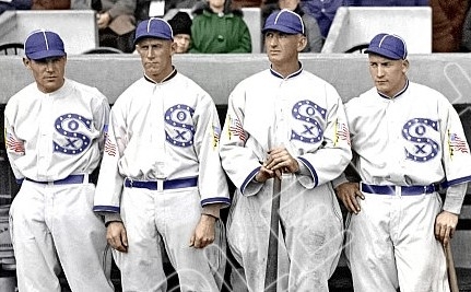
For some trivia, the White Sox used a blue fill with stars pattern in their logo in 1917 for the World Series, so this is not the first time it’s been done. (and look at the flag patches…maybe related to World War I?) A closer look at the pattern here from the Hall of Fame .
See all the teams’ hats at New Era’s Facebook page.


