
Spring 2016 Uniform Round-Up: Phillies Go Overboard; Eagles Go Grey(?!?)
Wow, that was quite an unexpectedly busy week in terms of uniform news. MLB and the Phillies released images of all of their league-wide special event hats and jerseys in one dump instead of the usual press release and ad blitz 3-4 weeks before the on-field date. And the supposed Eagles 2016 Color Rush featured color – for Thursday Night Football – was leaked on Twitter by @nflleaks. [Hint:Whether it ends up being grey or silver is yet to be determined. Nike’s Elite 51 template fabrics from 2012-2015 couldn’t render metallic shades. Hopefully, 2016’s Vapor Untouchable template can, because grey is boring, and all-grey is a distinctive look of the Seahawks. ALSO, this is just a rumor at this point, but it smells legit.]
For the Eagles, there likely won’t be any surprises. Last season’s Color Rush uniforms were just re-colored versions of the team’s existing template (though the Cowboys’ was a throwback design). Long story short, look for an all-grey version of the blackout set that’s been worn the last two years. MisterrAlex on the Eagles subreddit did a few mockups of the all-grey/silver combination with variations of the number fills and strokes. It doesn’t look bad, but the one issue that it has, just like the rest of the Eagles current set, it’s not Kelly Green. So, we’re likely still stuck with what seems to be Lurie’s continued disinterest in moving the green back to where it should be.
by Reddit User MisterrAlex
To see the rest of the 2016 Color Rush featured colors, here’s the perspective-corrected version of the image originally posted by @nflleaks. Why perspective-corrected? Because we love our readers here at CB, that’s why. Notes: The Titans and Washington are omitted because they were on page 2. They’re supposedly red and black, respectively. Interestingly, it appears the Bengals, Ravens, and Giants are up to something a bit different than the other teams; check out their swatches:
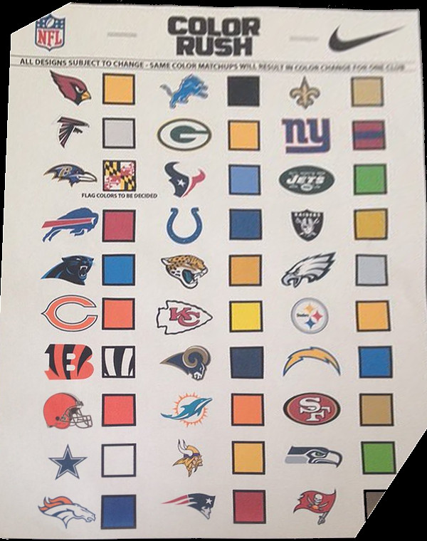
from @nflleaks original
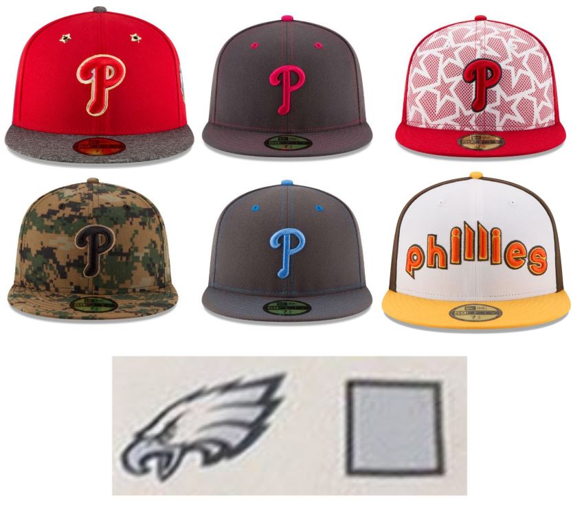
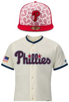
I stopped having much to say about the Phillies Memorial Day and Fourth of July hats a while ago; they keep finding new ways to render camouflage and/or red, white, and blue, and they’re (almost) always gross. No lessons were learned from last year’s horrendous Fourth of July jerseys, so it’s more of the same this season:
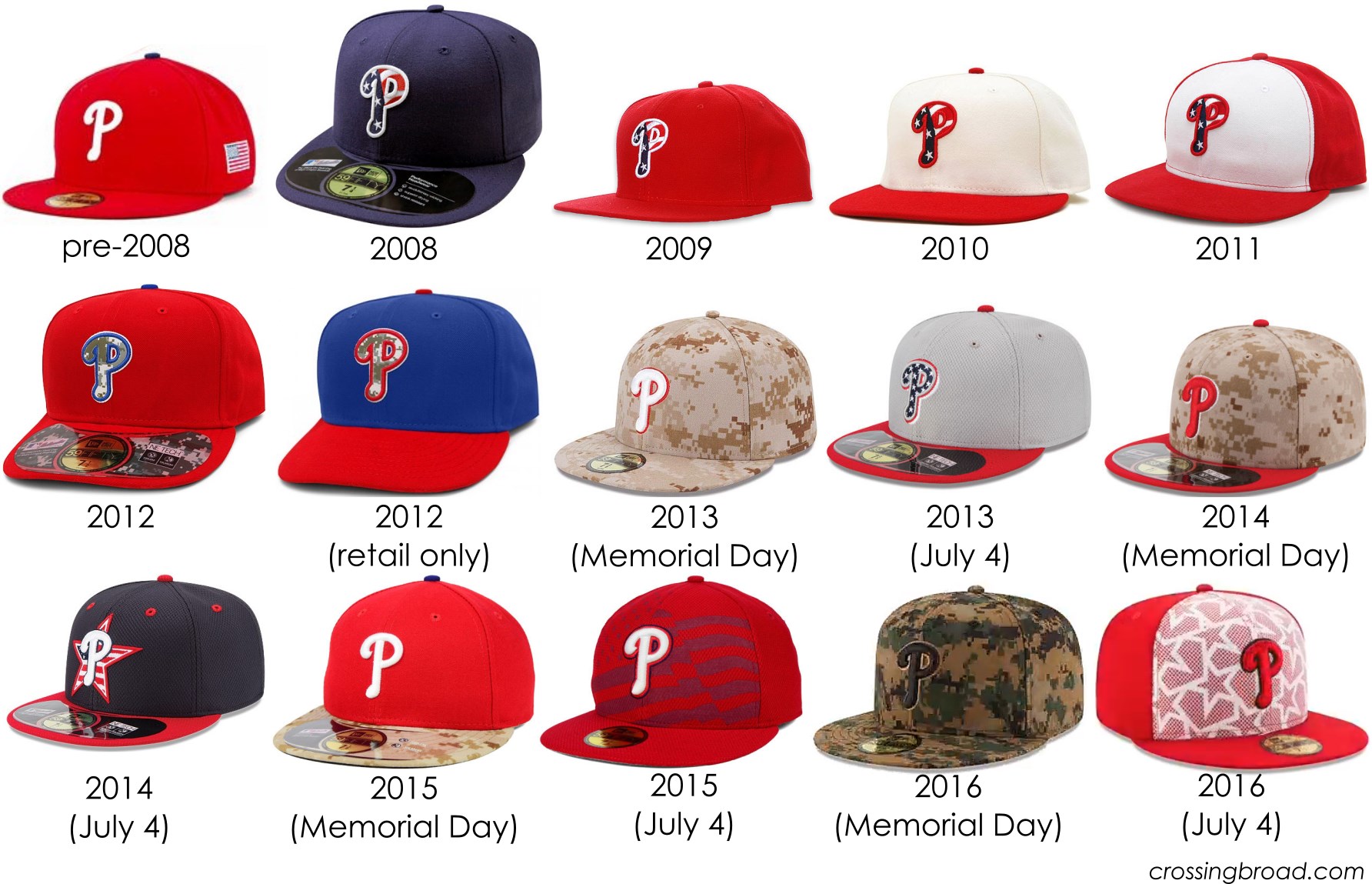
Ugh… there will be a fourth row next year.
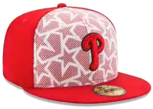
I don’t love this reasoning, but this doesn’t look like an MLB hat.
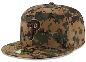
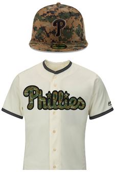
Much like the 2013 hat, but forest camouflage instead of desert. Also, no Phillies colors to be found…
from sportslogos.net – see below
from sportslogos.net – see below
This year, they add hats and jerseys for Mother’s Day and Father’s Day, too. And, yeah, both designs look something your aunt would buy for your mom.
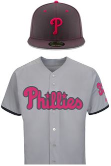
Mother’s Day – from Sportslogos.net
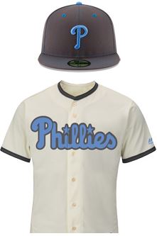
Father’s Day – from Sportslogos.net
Finally, they also released All-Star Game and Home Run Derby Hats. The All-Star hats are a downgrade from last year’s already dire design (seriously, a heath grey brim?). But the Home Run Derby design is a fun throwback to the old “Taco Bell” Padres uniforms… but, it’s so uniquely identifiable as a Padres design, that I wonder if there’d be much of a market for them:
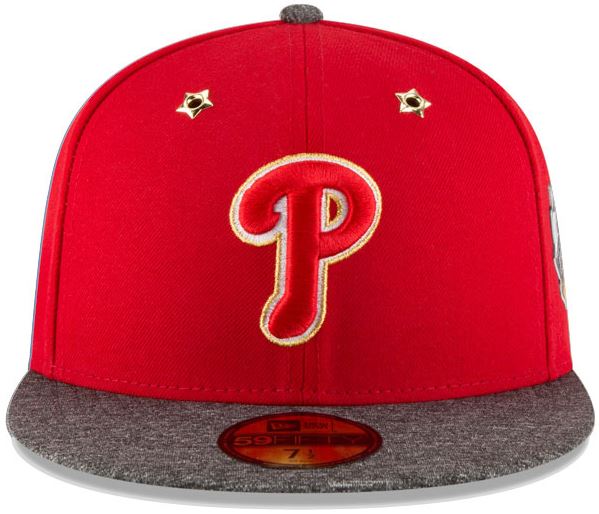
All-Star Game – need star eyelets, but why the grey brim?
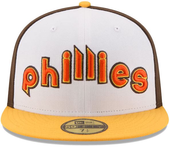
Home Run Derby Hat. A neat visual, but I can’t imagine many Phillies fans are going to be buying these.
2016 MLB hat and jersey pictures from sportslogos.net’s great write-up of the new products.