
UniDiction: Week 15 - Eagles vs. Giants

Luckily, I take credit for a win no matter how close the predicted score is to the actual score, so that Cowboys game was another in the win column, thank you very much.
So, we’re at the second Giants game of the year. I got the first one pretty much spot-on, so let’s see what we can do about the second one.
The Giants are rarely a "White at Home” team, so we’ll see them in Blue over Grey. I detailed this last time, but for a quick recap, both Giants home and away pants are grey, but the away pants show a red-blue-red set of offset, thin stripes, and the home pants are the same grey, except with wider, connected blue-red-blue stripes. I’ll call this a nice attention to detail sort of…um, detail, but really, kind of boring, regardless of the execution. Let’s face it, Grey (not Silver) is not a dynamic color; in sports, it’s most often thought of as the drab base color used for MLB’s away uniforms. There’s a reason people think of this, not this when they think of the Cardinal.
The Giants have what is inarguably a classic uniform, but is that enough to beat the Eagles in their second-tier White over Green combination?
Your UniDiction is after the jump.
Helmet
Eagles: 7 — Same as always. Definitely one of the best helmet designs in the league. I'm a sucker for "functional" helmet designs.
Giants: 6 — OK, sue me. I like it more this week than I did last time. The Metallic Blue with a simple Red stripe with the perfectly proportioned logo simply works. A point is subtracted because this helmet was designed in the 1950s. The Giants couldn’t come up with a better design more recently?
Jersey
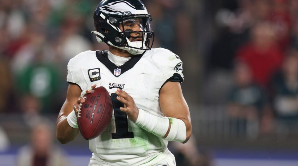
Eagles: 3 — The White jerseys are unfortunately nondescript compared to the Midnight Green. I've said it before, so I'll say it again, the White jersey just doesn't say "Eagles" the way that the Green one does. Sure, it's grown on me a bit this season, but it's not the one.
Giants: 3 – Their solid Blue home jersey is unfortunately described as, well, just that. It’s a solid Blue jersey with White numbers and name. They’re hiding a small “ny” logo above the front numbers, but that’s it. It suffers from the same problem as this year’s Eagles throwbacks. There’s just nothing there other than a sea of Blue. Classic or not, this is boring. At least their White jerseys (with their misbegotten Red accents) have Northwestern stripes on the sleeves to have something going on other than numbers on a solid color.
Pants
Eagles: 3 — The green pants are still a dubious decision at best. The Midnight Green tends to look generically "dark" on the lower half of the body, not an immediately noticeable color. The two-tone socks also work better with the white pants than the green pants.
Giants: 2 — As mentioned above, Grey is a color suited (pun!) baseball team’s drab, away, set, not a major component of a football uniform. No no no. This is all unfortunate because the wide, connected stripe pattern is a nice, visually interesting touch, and of course, the Blue socks contrast nicely with the White sanitaries (sure, most colors contrast with White, but still…)
Intangibles
Eagles: 6 Green is a Christmas color. Bring it, Giants fans.
Giants: 1 — Here’s one point for having a classic uniform set and I’d rather them dress like this than like this, so I can respect their respect for history. BUT, let’s face it, history class can be boring if the topic isn’t interesting, and the Giants uniforms are pre-World War I history of Europe. Giants fans (and 19th century European history buffs), bring it on.
Final Score:
Eagles 19
Giants 12
Random unrelated uniform trivia:
The Cardinals and the Texans wore solid Red last week. The Texans get my vote.
The Chiefs looked pretty darn good in their (rarely seen, but second time in 3 weeks) Red pants, and Falcons decided on a White-out.