
UniDiction 2011: Week 10 - Eagles vs. Cardinals and Week 9 Uniform Round-Up
 Week 10 – Note: DeSean not included.
Follow me on twitter @dancfuller
Ugly result, but a good looking game. My record continues to match the Eagles'. 3-5.
Week 9 Recap
With help from the Gridiron Uniform Database, Week 9 saw the Saints in their new-old(?)-for-2011 '60s throwbacks, making their second appearance, to which I can definitively say that the "accurate" nasty Yellow-ish Gold color should have been replaced with a new (actual) Gold color. Basically, take the template from the the throwback, but use new colors. At the minimum, the helmet would match the rest of the uniform, and a great design wouldn't be ruined by an awful color choice simply because of appeasing some "purists" who insist on copying "all" aspects of a throwback, even the ugly parts. "All" in quotes because it's not like they're out there in period-accurate cleats.
The Cardinals broke out their Black alternates (for the second and last time of the season), so I'll again take the opportunity to point out that the Cardinals use special White pants for these jerseys which replace the Red paneling with Black paneling, and they swap their Red socks for Black.
Finally, the Steelers wore their 1960 throwback for their first time this season. I'm actually a fan of the Yellow helmets (maybe because they're seen at most, twice each year?), but the White pants give the uniform an incomplete look due to expectations vs. history because "Steelers = Yellow Pants."
A Cardinals uniform overview and your UniDiction are after the jump (hint: the Cardinals uniforms are awful)
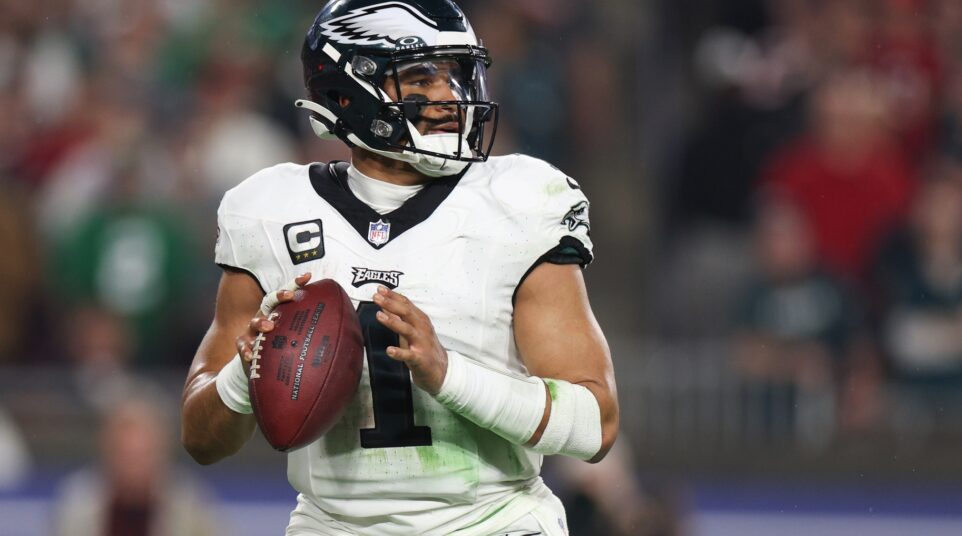
Week 10 – Eagles vs. Cardinals
This week, the Eagles take on the Cardinals, a team in the undistinguished company of the Broncos, Seahawks, Falcons, and Vikings as teams with "modern for the sake of modern" uniforms which try too hard, but simply don't work. (I wouldn't argue too strenuously if you were to include the Titans in this list, but I happen to like the awkwardness of their design. We won't even mention the Panthers 90s monstrosities) The Eagles will be in their Green over White combo, so from a uniform standpoint, the Eagles are in a good spot whether the Cardinals show up in White over White (their usual White jersey combo) or White over Red (a very rare combo). For completeness' sake, the Cardinals normally wear Red over White for their "color" jersey combo, Red over Red as a (shudder) "red out," and Black over White as an Alternate.
The UniDiction
Either 2, 3, 6, or 7 points awarded for each category (safety, field goal, touchdown, touchdown+point after, of course)
Helmet
Eagles: 7 — Same as always. Definitely one of the best helmet designs in the league. I'm a sucker for "functional" helmet designs, and the wings fit the bill.
Cardinals: 6 — The current Cardinals uniform/logo set began in 2005, but the while the helmet was updated in 2005, it really hasn't changed since 1961, when it was part of the St. Louis (football) Cardinals uniform. The 2005 refresh made the helmet logo look slightly less awkward (and 32% meaner, as is apropos for sports logo refreshes this day and age), but it's been relatively unchanged in 50 years. It's immediately recognizable, never confused with the "baseball Cardinals," and quite a bit striking on the stark White of the helmet. BUT, minus one point because, well, actual Cardinals are Red, couldn't the helmet be Red? (ornithology geek warning…) And, really, if the helmets were Red, couldn't the facemasks be a combo of Black and Orange-ish, just like a real Cardinal? Sorry, got carried away there. Anyway, 6 points.
Jersey
Eagles: 6 — When fans think of the "post-Cunningham" Eagles, they're picturing the Midnight Green jerseys. A unique, bold color, with detailed strokes on the numbers, and nice use of logos on the sleeves and collar. I'll remove a point due to the use of drop shadows.
Cardinals: 1 — The only thing worse in the Cardinals uniform closet than the Red jersey is the White jersey. WAY too much going on. Red shoulders which oddly extend partially into the sleeves, a Red panel and Black piping separating the White from the Red. If the numbers had drop shadow instead of stroke, it would have every overly done uniform element from the 2000s.
Pants + Socks
Eagles: 6 — The White pants provide nice contrast with the solid green of the jersey, and instead of plain white, the thick Black ad Green stripes (with the pencil thin grey stripe) on the side of the pants gives them a slightly modern touch. Black over White socks also break up the White from the pants. I wouldn't mind if they swapped the Black socks for Green, though.
Cardinals: 3 — Well, thankfully the socks are simply solid red. The rest of the lower-body uniform doesn't have much to be thankful for. I guess vertical stripes would be too much to ask for, so naturally, the only option was some sort of curve-bound… thing. Sure, it "connects" with the inexplicable panel on the jersey, making that panel slightly less vestigial, but it's simply ugly, especially how it doesn't terminate at the knee. Instead, the curves bounding the Red fill meet about 4 inches from the knee, then continue as a straight line. HUH? Sadly, the Red pants are even worse, with the panel being split between White and Red about half-way down. Sensibly, the special White pants worn with the Black jerseys use a Red line as the boundary line between the White and Black.
Intangibles
Eagles: 3 — I oscillate between liking the current Green and wanting the Kelly Green to return. This week is a "bring back the Kelly Green" type of week.
Cardinals: 2 — I'm giving the Cardinals more than a goose egg because, sure, they have a disastrous uniform, but the classic-style uniforms they replaced weren't all that great. It's not like the Cardinals have a specific, obvious "better' uniform from their best (think of the Vikings throwbacks vs. their current set). I am liking the Arizona flag on the sleeves of the previous uniforms, though. They show up in White over Red, change this to a big, fat zero.
Final Score
Eagles 22
Cardinals 12