

Now the MLB is Threatening Ugly Jerseys to Match the Ugly Fourth of July Hats
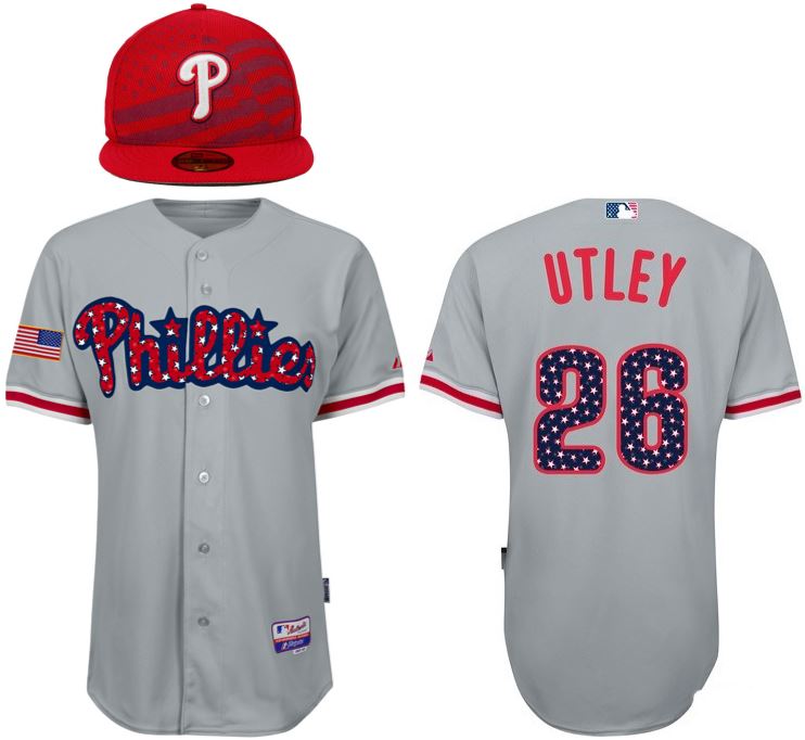
My God! It’s full of stars!
(from MLBShop.com)
Why “threatening” you ask? Because an almost identical July Fourth design showed up last year around this time, June 11, 2014, to be exact.. The difference? Last year’s was a “replica” jersey (in quotes because the official dilineation is “replica” for retail only, “authentic” for “on-field and retail), and this year’s is categorized in the on-field category. They have the correct on-field style tagging (bottom-right), and they’ve devoted copy explicitly saying these will be worn on-field. And speaking of explicit, look at these things. Yikes. It looks like a 6 year old’s Trapper Keeper. All it’s missing is the Lisa Frank signature.
So, based on the website listing and details compared to last year’s replica, this “threat” is more like shots fired and, um… all-out war(?). I’m trying to stick with the Stars and Stripes/gung-ho America theme here but struggling. It’s bad.
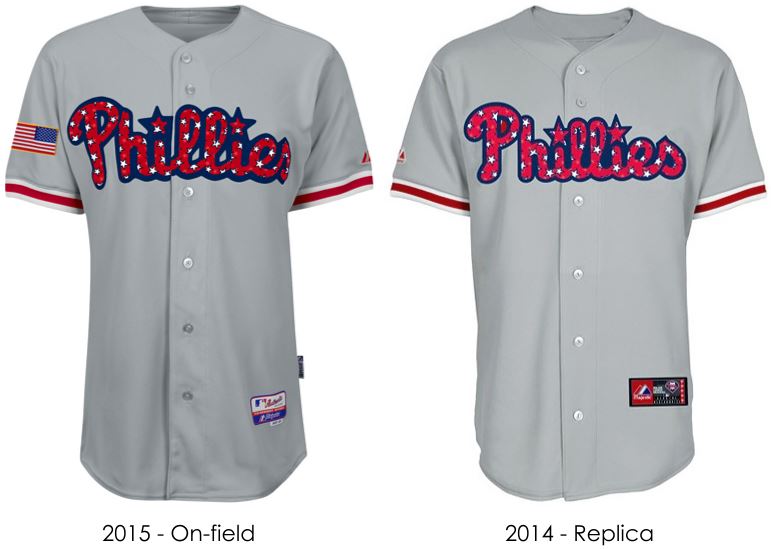
It has not improved in the past year.
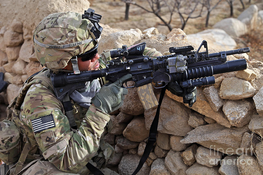
For those saying “but the flag is backwards!” it’s actually not; the flag is oriented that way on military uniforms, too. Think of how a flag orients itself when its held by someone on horseback.
(Please don’t) get yours here.


