

The 2015 Phillies Fourth of July Hat is Here, and It's Something
from lids.com
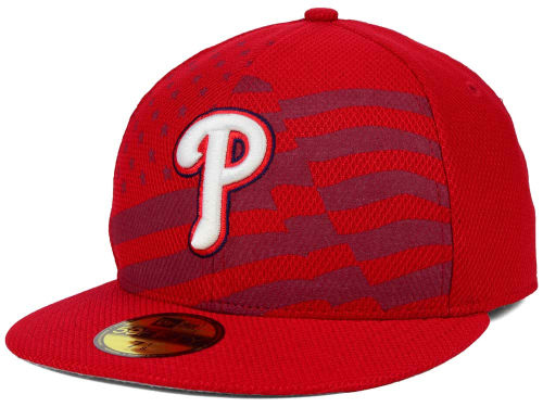
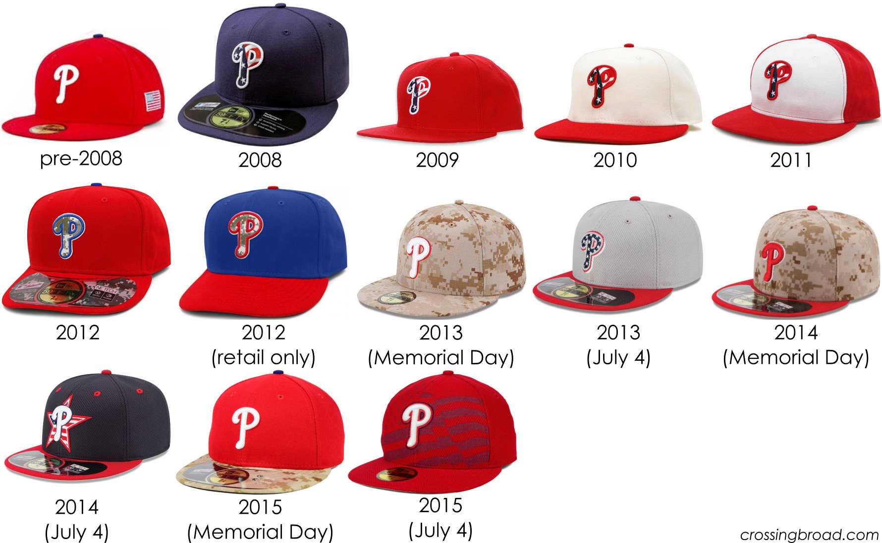
After years of Stars and Stripes hats, then camouflage hats, then 2013 introducing separate hats for Memorial Day and the Fourth of July, we arrive at something a little different for once. It seemed like MLB was running out of spots on their baseball hat template to swap in red, white, blue, or camouflage panels, so the Fourth of July brings an all-new design with what looks to be the first appearance of dye sublimated printing (think the pattern on the Seahawks numbers) on MLB hats.
Interestingly, the design for the Fourth of July hats leaked a month ago on uni-watch.com, but only the Dodgers version. A few other teams had trickled out in the mean time, but the Phillies’ design finally showed up this week. The uni-watch.com write-up mentions batting practice hats for the Fourth of July as well, but the Phillies’ is nowhere to be found as of today.
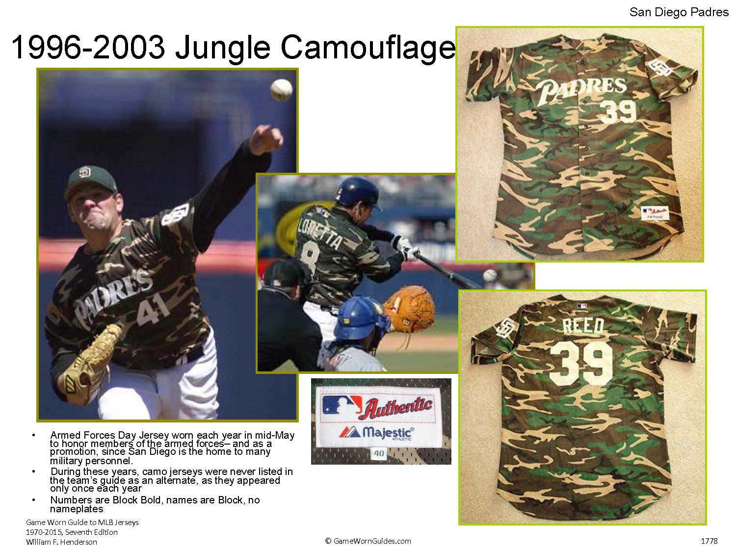
At this point (and for the last few years), spending any time saying that they’re ugly is a waste of time (note: this has never stopped me from spending that time), but these are uniquely ugly. Good or bad, say what you want about the previous designs (see below), but these are the first that don’t look like on-field MLB hats. That dye sub (industry lingo!) pattern moves it from “ugly but has a place on-field” to “random Phillies hat on Amazon that your six year old nephew would love.” (My six year old nephew likes the Star Wars Clone Wars TV show more than the original trilogy. He has awful taste. And he’d love that hat.) And even though camouflage on the hats was a big change in 2012, the concept of camouflage on a baseball uniform wasn’t a new one; the Padres had been wearing camouflage with varying frequency since 1996(!), so it was far from an all-new term in the MLB uniform design language. (that Padres picture is from Delaware County’s own William Henderson’s Game Worn Guide to MLB Jerseys which just had the release of its 7th edition. If you’re at all interested in this stuff, it’s a must-have.)
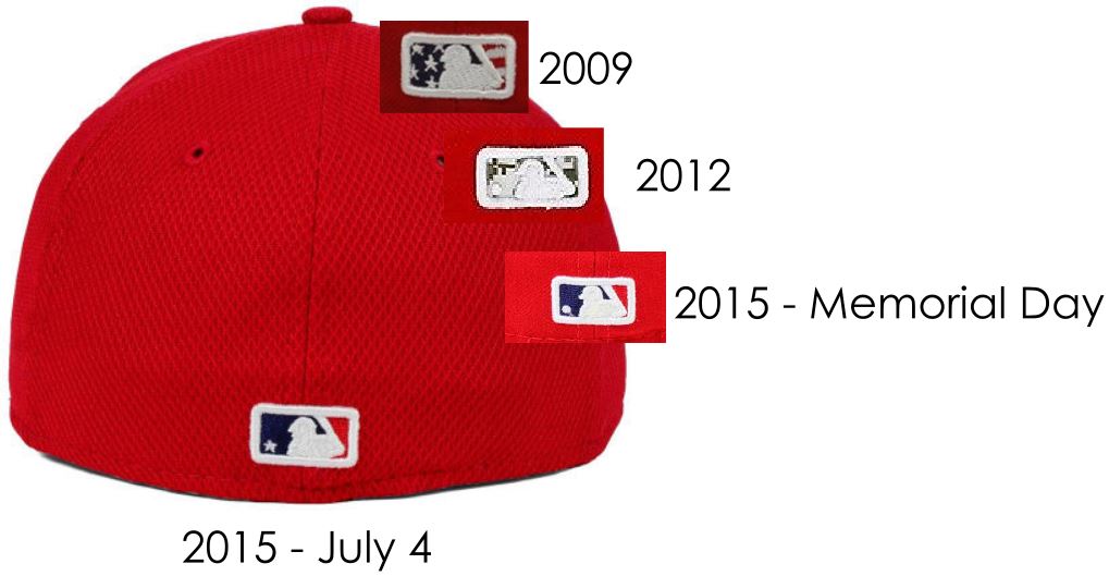
But, there is a very neat detail that I would practically call “cute” despite the hand-wringing above. I complained about the plain batterman logo on this year’s Memorial Day hats, but check out the hidden detail in these. The ball in the logo is a star! Precious!
There’s a tone of sarcasm about this above, but the star is a very cool detail.
Ok, so that’s something I like about the hat. Literally, the smallest feature on the entire thing. To be fair, I also like that red is already one of the Phillies colors, so the hat color itself, either navy blue or red, depending on team, already pretty much looks like a Phillies hat. Oddly, the complaint “it doesn’t look like an on-field MLB hat” sounds more like the typical “it just doesn’t look like a football uniform, you know?” critique when a college or NFL team goes far outside the box. The Marlins probably have the most outside-the-box MLB uniform, but no one ever says “it doesn’t even look like a baseball uniform!” The MLB uniform box is extremely small, and what dye sublimation can provide is squarely outside it. Maybe it’s just progress, but look through the onward march of the designs from the last seven years. They’re all variations on a theme until we get to last year’s July Fourth hat (which may be uglier than this year’s, to be honest). Even the 2014 Stars and Stripe hat fits in with the pattern of “final products made from the similar ingredients;” likewise, the 2015 Memorial Day design is still throwing a camouflage dart at the hat template until it lands somewhere it didn’t in the prior years. After this year’s fluttering flag Fourth of July design, the possibilities for future designs have been blown wide open. I’m not thrilled about this, but I am interested in seeing if this becomes a trend outside of one-off designs. (the concept of complicated fill patterns made with thread debuted in 2008 and [still?] hasn’t been used outside these designs; the closest is the “W” in the Nationals alternate jerseys.)
Ugh. Even the designs were better when the team was better.
