
Ad Disclosure
UniDiction 2011: Week 5 – Eagles vs. Bills
By Dan Fuller
Published:
Follow me on twitter for uniform-related updates during this week's games (@dancfuller)
Predicted score: 23-23. Actual Score: 24-23. Finally, the System works. Of course, the Eagles lost in a particularly ugly fashion (bad unintentional pun!), so at least we're keeping perspective. Speaking of perspective, my perspective is that I was close enough on the score last week to count it as a win, so I'm officially 1-3.
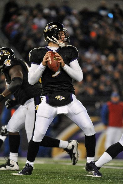
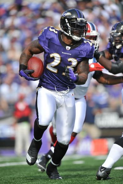
Other than the stupid pink accessories (the extent of their use humorously detailed on Uni-Watch Blog on Monday), there were few uniform stories last week. But where there were stories, the story was Black. With assistance from the Gridiron Uniform Database, the Cardinals wore their Black alternates against the Giants, and the Ravens brought out not only their Black alternate jerseys, but their Black pants as well. Wearing Black socks with Black pants, it looks like the players are wearing tights. Blech. Of course, the Ravens also combine their Black alternate with their White pants, and, gosh, doesn't Black over White look a whole bunch better than Black over Black? Speaking of Black over White, the Cardinals actually use unique pants and socks with their Black jerseys. Notice the Black…umm… accents on the alternate-paired pants opposed to the normal White+Red pants. Also, the Black socks used in this combo are unique to this look. If the Cardinals had a more respectable uniform template, the Black alternates would be acceptable, but the Black jersey next to the stark, White helmet is visually jarring. I like the Ravens Black alternate jerseys; in fact it would make sense the Black jerseys the primary jerseys. Ravens are Black. (just like Eagles are green. Oh, wait) Random question Philadelphia fans: Do you think the Ravens primary jersey is Black or Purple? Being an NFC city, we don't see the Ravens very often, so our ignorance is acceptable, but the answer is Purple. It would just make sense to make Black the primary jersey.
Other news that came out this week: the Broncos announced that Orange would be the color for the primary jersey starting next season. The easy assumption is that they would swap their Blue jersey with the Orange, but in terms of uniform geek drama, the Broncos are on the shortlist of teams (also, Seahawks) which will likely get more than "template update" type changes when the Nike contract kicks in next season. We'll see. Generally, the current Orange jersey looks awkward compared to the Blue jersey in the current uniform set; a new design, perhaps throwing back or “faux-ing” back to the Orange Crush era would be appreciated. The current Orange over White combo is similar to the Bears' Orange alternate jersey, such that it doesn't look wrong, but doesn't look right either.
On to the Bills and Eagles this week…
The Eagles are in White jerseys, likely pairing them with Green pants, so that's not a good place to start. For 2011, the Bills replaced one of the worst uniform sets in the league with one of the best. This might not end well.
The UniDiction
Either 2, 3, 6, or 7 points awarded for each category (safety, field goal, touchdown, touchdown+point after)
Helmet
Eagles: 7 — Same as always. Definitely one of the best helmet designs in the league. The wings add a lot more character to the helmet than if they simply dumped a logo on the sides.
Bills: 6 — I'd wager that most of the Bills-ignorant (or Bills-ambivalent) fans out there assume that the Bills new 2011 uniform set is simply the popular throwback that's shown up since 2005. Helmets are White, jerseys Blue (or White), pants White. But they're not, and the differences begin with the helmets. Take note of the "standing buffalo" of the throwback vs. the "charging buffalo" of the new uniforms. Using the White background was a nice call-back, while using the modern (read: post-1974) kept it from looking old. I'm not on-board with the non-constant width helmet stripe, so minus 1 there.
Jersey
Eagles: 3 — OK, I'm not liking the White jersey this week. I know I'm supposed to rate it as a jersey alone, but knowing they're probably going to be wearing it over Green pants, and it just doesn't look very good. So, yeah, jersey by itself, good. Jersey in real-life, on the football field, paired with Green pants? Not so much.
Bills: 6 — It's almost a perfect "Classic-"style jersey. Traditional striping (double sandwich stripes on the sleeves), strokes instead of drop-shadows around the numbers, and a traditional template without any paneling (Vikings), yokes (Titans), or funny business (Falcons). Oddly, they include a "charging Buffalo" logo above the name on the rear. Why in the world would they include that? It's like a visual wart. Minus 1.
Pants + Socks
Eagles: 2 — I really don't like these. The socks should be green, and the stripes on the pants aren't bright enough to offset the general, dour greenness of the pants. If they wear the White pants, change this score to a solid 6.
Bills: 6 — Again, a traditional design: White base material, Blue-Red-Blue sandwich stripe on each side of the pants, and a very unique sock design, with a touch of blue at the knee for contrast against the pants, then two Red-Blue-Red sandwich stripes. BUT, like the back of the jerseys, they dumped a logo on the hip. A hip logo in and of itself isn't offensive (for trivia's sake, the Eagles had a hip logo on their Green pants in 1996 – warning when clicking that link: Uniform folks' brains might explode due to how similar the original versions of the current Eagles uniform looked, but also how different they are). So again, full 7 points, but minus 1 for the incongruous logo. Attention uniform designers: if the Vikings do it, too, I'm going to deduct for it.
Intangibles including SPECIAL OCTOBER ADJUSTMENT – each team will lose points corresponding with just how poorly pink goes with their color scheme
Eagles: 0 — Unfortunately, the Eagles are playing against a team among the uniform elite. Against the Falcons, the White over Green combo could compete, but against a unique and a "classic" design with a modern twist? Good luck. If the Eagles show up in White over White (unlikely), move this to a 6. The Pink towels will look awful over the Green pants, so minus 3 for the October adjustment.
Bills: 5 — The Bills replaced something truly hideous with something quite nice. Their easy option would have been to just make their throwbacks their full-time uniforms, but instead they decided on mixing up the old with the new. BUT, they don't wear their White jerseys with Blue pants (yet?). A point is deducted. They lose 2 points for how poorly Pink fits into their color scheme.
Final Score
Eagles 12
Bills 23
Here's to hoping this doesn't prove accurate, and let’s hope the Eagles score well above 28 so the whole “score wraps at 28” thing can come into play.
Here's my archive of Bills uniform pictures. Get out the acid after you look at the previous uniform set.
