Ad Disclosure
I F-ing Love The New NCAA Tournament Courts
By Kyle Scott
Published:
I’ve always had a weird, weird fascination with arenas, stadiums, fields, playing surfaces, arena lightning, DASHER TRIM, and more. For instance, I used to be able to tell which arena a hockey game was being played in just by looking at the lighting and the trim around the boards. Nashville! Philly! San Jose! Looks like Philly but it’s Chicago! I once filmed an Avalanche-themed sequel to Sudden Death – because I was so enamored with the inner-workings of a hockey arena – in my basement in which I was Jean-Claude Van Damme’s character, and my neighbor, Danny, was essentially my punching bag. I drew up SCHEMATICS of the bowels of McNichols Sports Arena to use as a prop for the film, which received rave reviews from my parents, a wide range of Eric Lindros posters, and an increasingly frightened Danny, whom I may or may not have been holding hostage by the time I edited the film on a VCR and premiered it after dinner time. And I used to get mad when NBA Live didn’t have the proper court for the Sixers, or MVP Baseball 2005 had the left field terrace at Harry The K’s entirely too high and steep (!!!).
So, to say I have a fascination with the frivolous in sports would be an understatement. Enter this post on the NCAA Tournament courts.
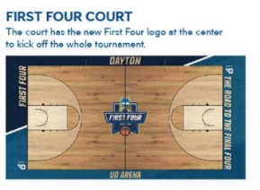
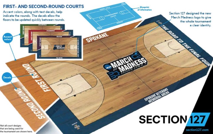
I fucking love them:
NCAA.com, which I’m surprised doesn’t require you to sign your life away and sacrifice a midget before reading to quench their insatiable desire for pain and suffering, describes the new concept:
The NCAA announced today a new series of court designs to be used during the NCAA Division I men’s basketball tournament, part of a redesign of all 90 championships beginning with the 2015-16 championship season.
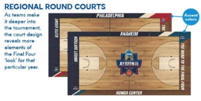
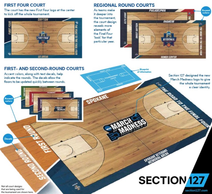
The men’s basketball court designs reflect the new cohesive brand for all NCAA championships. Feedback received about the previous court design was that courts looked alike, with little variation from site to site. The appearance was adjusted to help fans watching the games on television visually discern the difference from one site to another. This was done through different color schemes and court content from site to site and round to round.
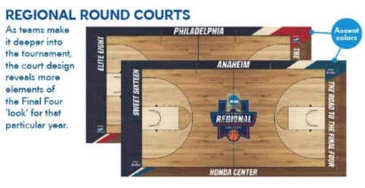
The tonal wood color on the court gives it a modern but still classic, clean look. The March Madness logo at center court for the first and second rounds replaces the blue disk to capture the excitement of the tournament. Site specific logos are used for the First Four and regional courts to build equity in the new system.
The unity ribbons were removed, along with the NCAA word marks, as part of the new design. The NCAA will honor and celebrate the military at this year’s Final Four.
The round name in the end zone apron on all courts will be a decal and replaced by the host/venues with the name of the next round on the off day.
The overall design, colors, logos and other markings are placed in a progression by round, culminating with the look of the Final Four court.
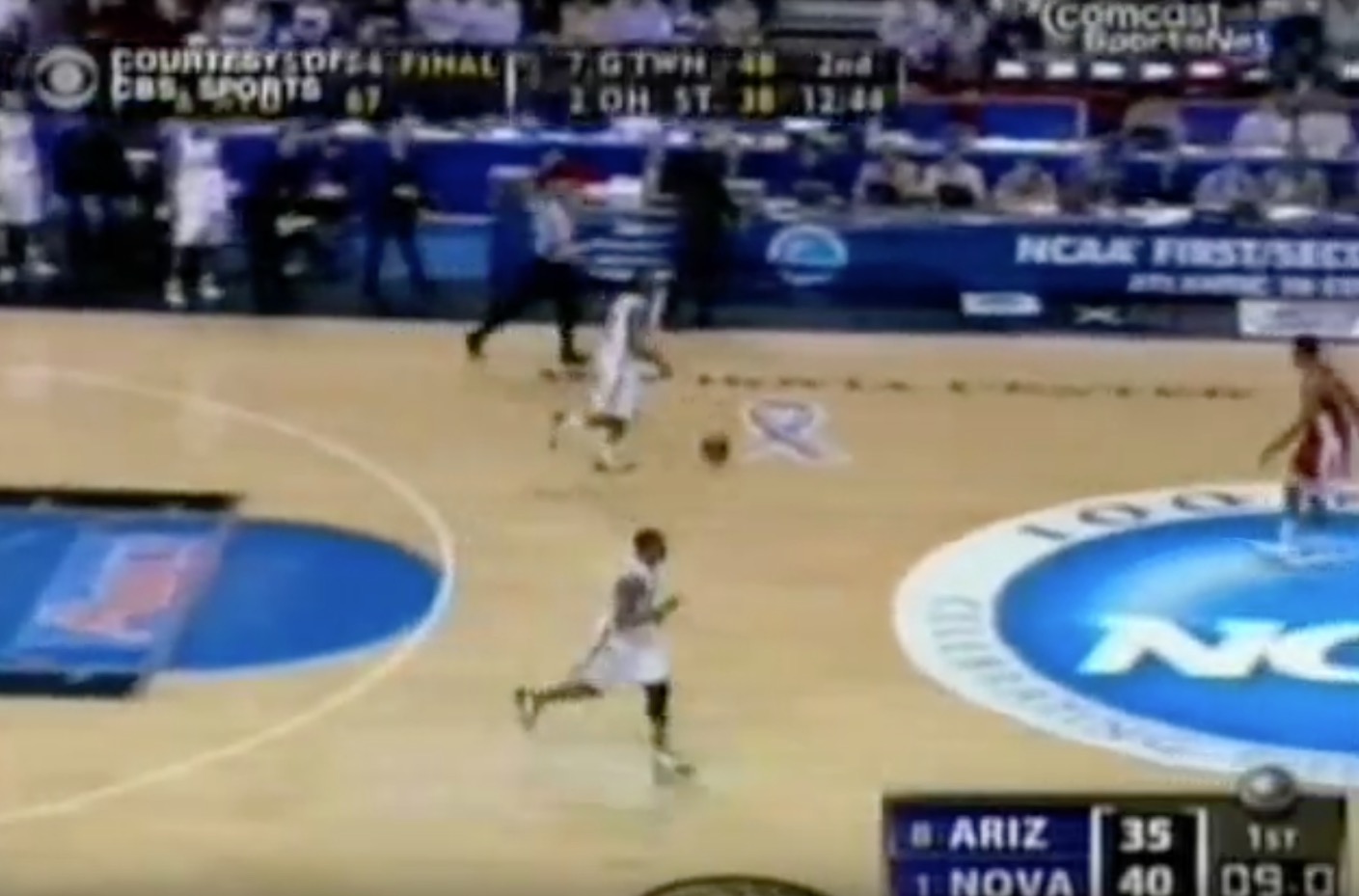
It’s always bothered me how there seemed to be no unity amongst the courts. The black and blue trope in recent years has helped, but it’s only further neutered the antiseptic feel of the tournament. It had become damn near impossible to distinguish between games as you jumped around or went split-screen, and it was only marginally better than the hellscape that was the years where some courts retained their original look – I feel like Utah always had their regular court – while others had an NCAA-branded floor. And that’s not to mention the garish, decal-laden Wachovia Center court in 2006:
WHAT IN THE ACTUAL FUCK were they thinking? This court used to make me literally angry when I would watch highlights of Allan Ray icing Arizona in the second round.
These new courts, on the other hand, are clean, distinguishable, and increasingly colored with local flavor as the tournament progresses. And this Philly court is ???:
We’ve come a long way since 2006. A LONG way.
Kyle Scott is the founder and editor of CrossingBroad.com. He has written for CBS Philly and Philly Voice, and been a panelist or contributor on NBC Sports Philly, FOX 29 and SNY TV, as well as a recurring guest on 97.5 The Fanatic, 94 WIP, 106.7 The Fan and other stations. He has more than 10 years experience running digital media properties and in online advertising and marketing.
