
Ad Disclosure
An In-Depth Review of the Flyers’ 50th Anniversary Jerseys
By Dan Fuller
Published:
The Flyers’ 50th Anniversary Jersey landed with a thud. They got buried online (by Kyle, the “online uniform community,” and many, many people on Twitter). Let’s take a look at why the Flyers have a swing and a miss on their hands.
* I won’t call it a “sweater” the same way that I won’t call a soccer field a “pitch.” We’re 2-0 against the Commonwealth and Kingdom, and I’m not going to give up now.
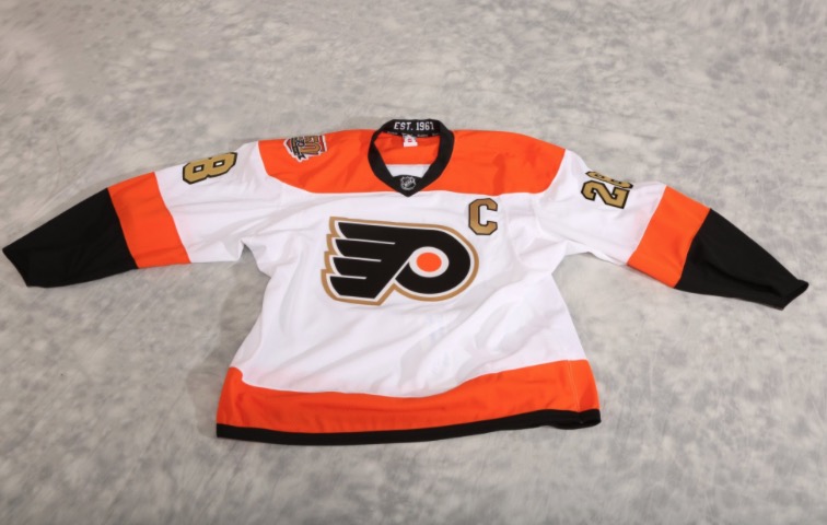
First, it’s lazy. It’s kind of their current white jersey with gold swapped in strategically. The orange yoke stops at the shoulder instead of continuing to the sleeve. Outline the logo and fill the numbers and Captain’s “C” with gold, and that’s about it. I actually don’t hate the use of gold, but it’s being wasted on accents on what amounts to the current uniform.
Second, the addition of gold makes it look just like a hypothetical white Anaheim Ducks jersey. (for reference, the Ducks actual orange alternate jersey):
https://twitter.com/rds9674/status/771059353046638592
Third, they didn’t win the World Series.
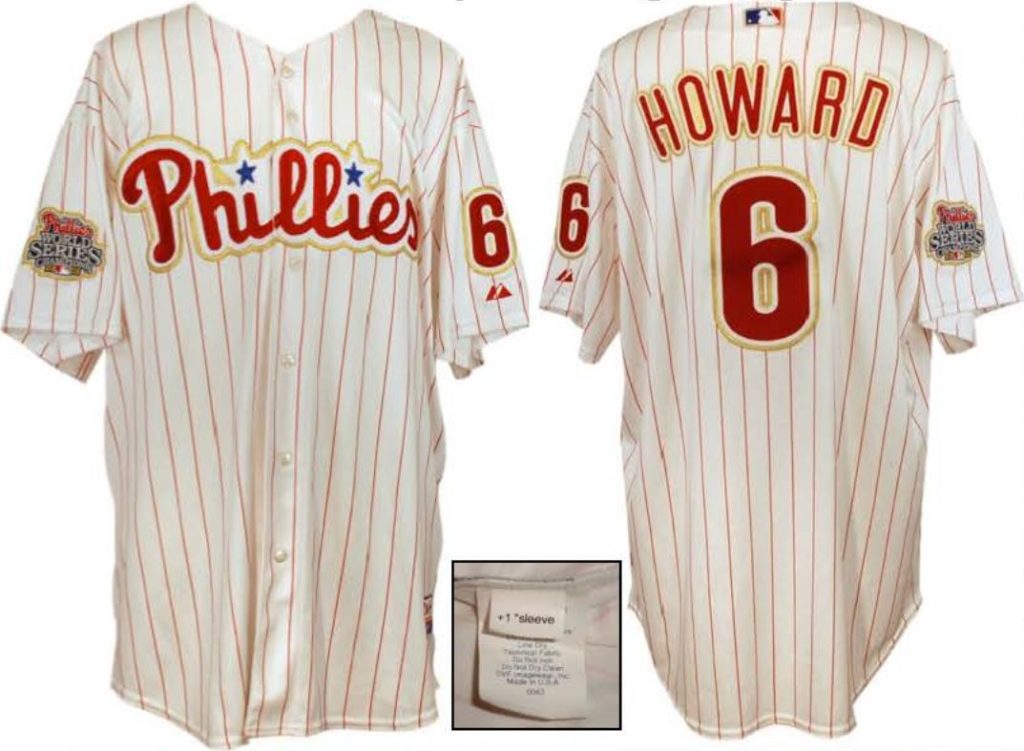
2009 home opener uniforms via Bill Henderson’s awesome Game Worn Guide to MLB Jerseys – 7th Edition – https://gamewornguides.com/
Fourth, that hype video… alchemy (WE’RE TURNING BLACK INTO GOLD AT A MOLECULAR LEVEL!) is so pre-Renaissance, and they obviously didn’t want to spring for the rights to Disparate Youth so they used the stock music equivalent. And Santigold is even from Philadelphia! (Hey, Jim, enough dirty hipster street cred for you with this take?)
Fifth, why is the patch in the shape of a keystone (again)? Pennsylvania has two hockey teams, and we shouldn’t have to share this with Pittsburgh. This should be the Liberty Bell, cheesesteak, or a blue collar.
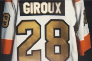
Sixth, even though you said the gold was fine, it’s little gaudy, right? Actually, yeah, it is. Especially on the gigantic rear numbers. Wouldn’t gold stroke around black or orange numbers be better? (gold stroke on the white letters of the nameplate works quite well, though…)
What would be better? Maybe this is too far outside the box, but what if they wore throwbacks to the actual 1967 jersey? We love that retro stuff. Look at the number typeface. It’s just thin enough compared to the current uniform to look legitimately old. And, hey, what’s that? The orange yoke continues to the sleeves… just like the current white jersey. The current alternate, which traces back to 2011, was a designer’s interpretation of the Flyers generally consistent identity imagined as a 1930s/40s old-timey uniform, with a non-white shade of white and a drawstring collar because, again, old-timey. Note that none of these elements were present in 1967. That doesn’t make the current throwback bad/ugly/worth replacing, just that the Flyers still have a throwback angle to play… and they aren’t.
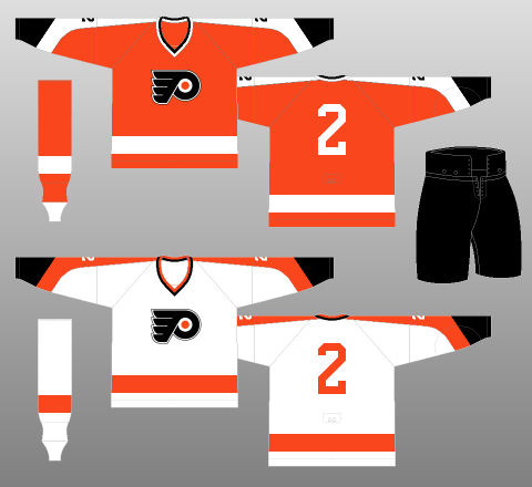
1967 Uniform from http://www.nhluniforms.com/Flyers/Flyers01.html
It’s not that bad is it? Actually, no. Thankfully, gold and orange are similar-ish colors, so everything still “goes together.” There are obvious worse alternate jerseys in the NHL as of today (Islanders and Lightning, namely). And, come on, it still looks like a Flyers jersey. It’s not like it’s this… thing.
Anything else that would work instead? Yes! A season-wide throwback “event” for the 50th anniversary. Instead of one throwback design that actually isn’t a throwback, cycle various actual throwback designs in and out throughout the year for, let’s say, Saturday home games. The Canadiens, Cubs, and even Astros have done it. The Flyers have a remarkably consistent uniform design, but even if it’s been uneventful, there have been changes as years have gone on that the fans remember. I can’t be the only fan who watched in the late 90s who wouldn’t mind seeing the black jerseys again (though I might be the only person looking for the 2002-07 orange+silver alternates to make an appearance).
