
Ad Disclosure
Ranking the NFL’s Color Rush Uniforms, from Vomit-Inducing to Beautiful
By Jim Adair
Published:
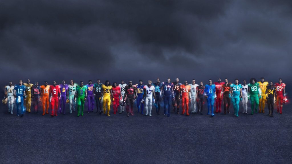
All of the NFL’s color rush unis are here. The whole thing is a bit of a mess, since the league didn’t account for match-ups and some teams won’t even wear these at all. Aesthetically, some are very good, some are personally offensive, most are boring. Let’s rank ’em:
#32 – Browns
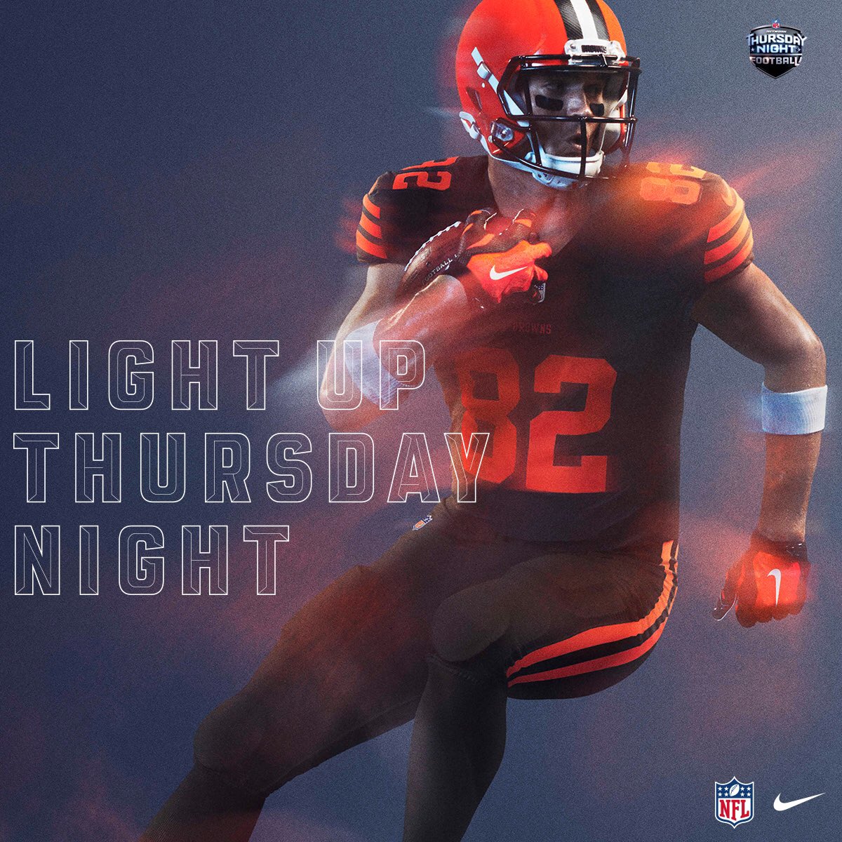
Is there any uniform in sports that is more boring? They revamped their whole look last year and somehow made it worse. This is only the slightest variation of their Sunday regulars.
#31 – Giants
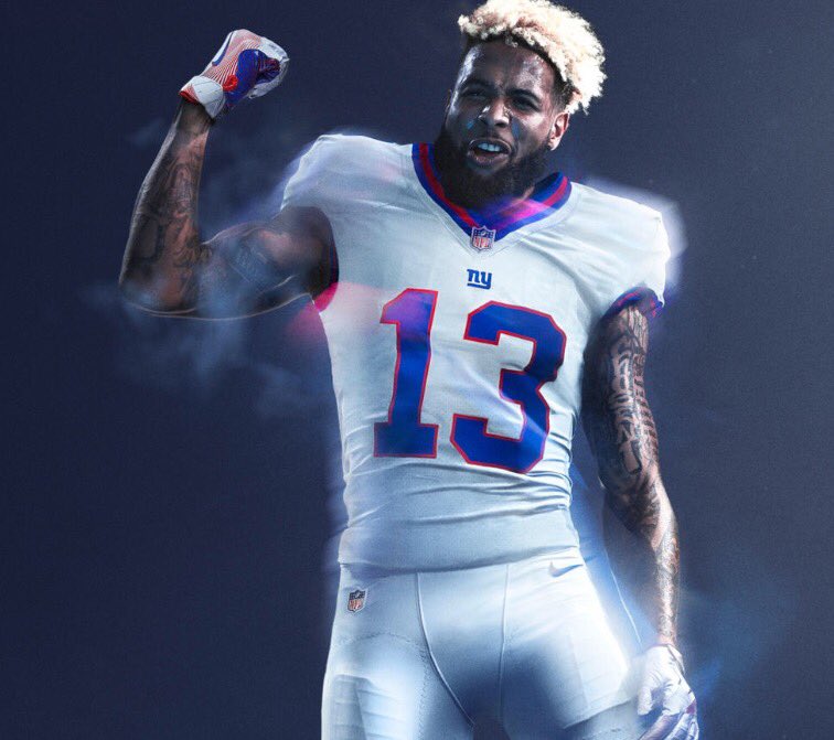
This is actually a very clean and nice uniform, it just loses a bunch of points since it’s a Bills uniform AND ALSO WHITE.
#30 – Buccaneers
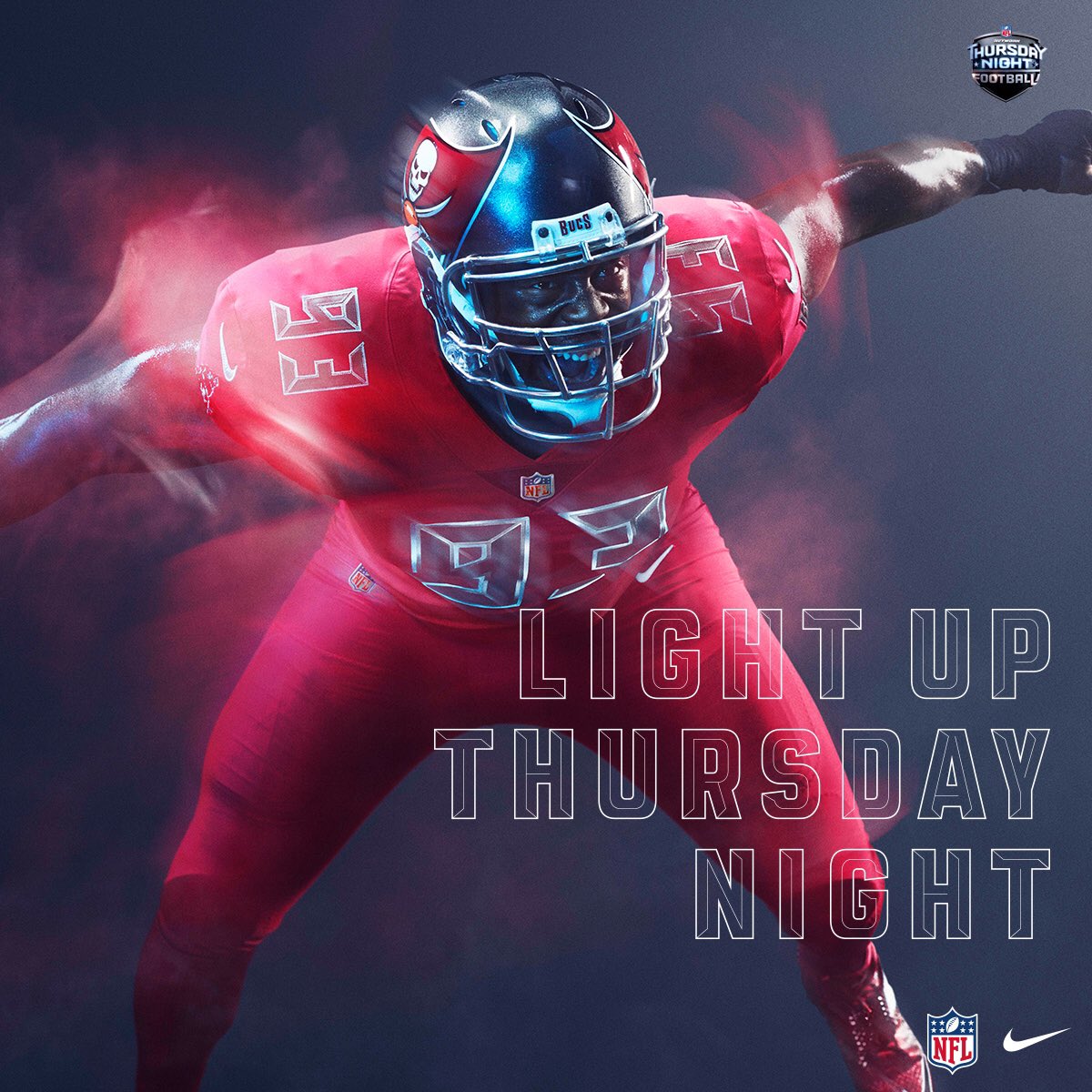
Nothing the Buccaneers ever do will be good with that garbage-ass CVS alarm clock font. Side note: The Alstott-era Bucs are one of the only teams that would have actually benefited from a black alternate but never made one.
#29 – Redskins
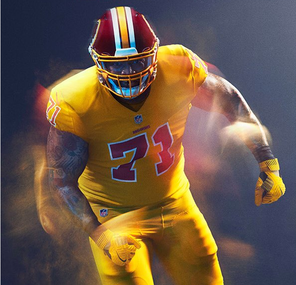
Extremely loud and incredibly gross, just like their owner.
#28 – Cowboys
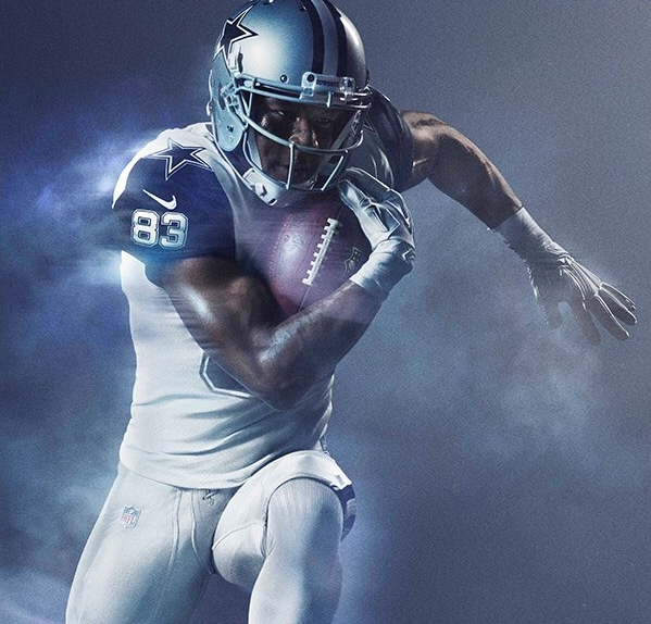
I know they’re supposed to look like an update of this, and they did a good job of modernizing that look. It’s just that the look was trash to begin with.
#27 – Bears
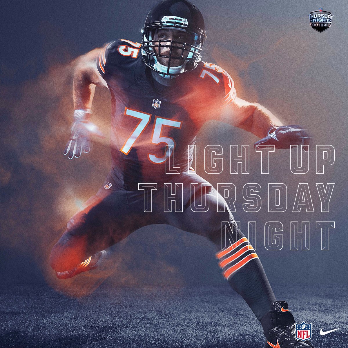
And here is where we enter the “There’s a difference?” section of the rankings.
#26 – Chiefs

“There’s a difference?” Also vertical stripes down the pants and horizontal stripes of the same thickness across the socks looks weird.
#25 – Jets
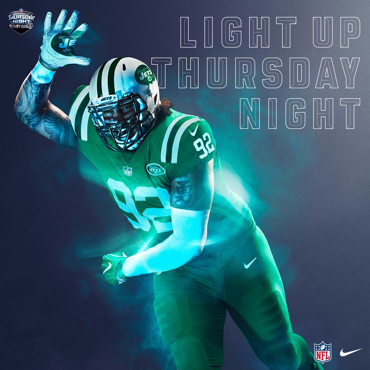
“There’s a difference?”
#24 – Packers
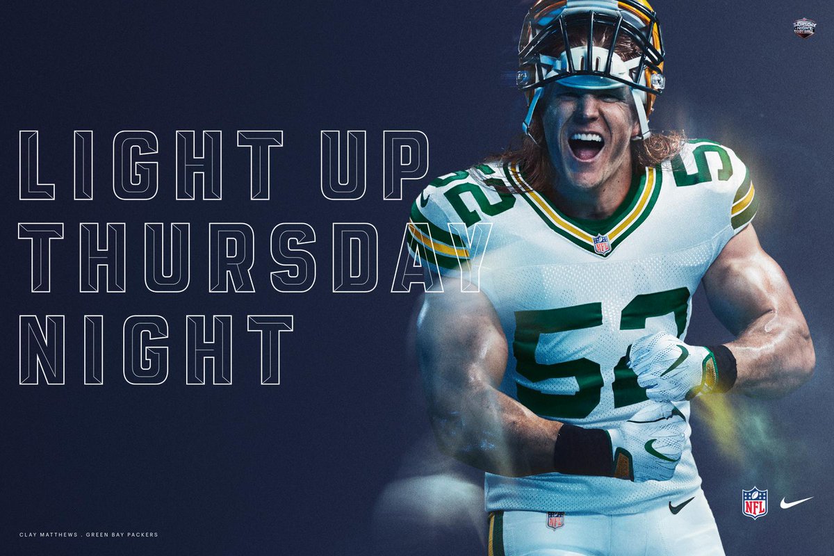
It’s like wearing your school uniform to dress-down day.
#23 – Seahawks
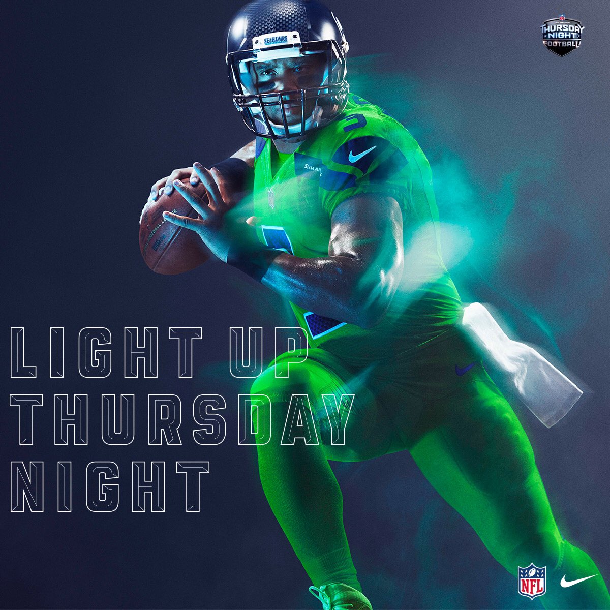
This opinion may actually get me fired, but burn these. I’ve hated that color since the day it was introduced in the Seahawks logo and dad-Sketchers everywhere. This looks some bullshit Jump Ball jersey from Starship Troopers, in a bad way.
#22 – Texans
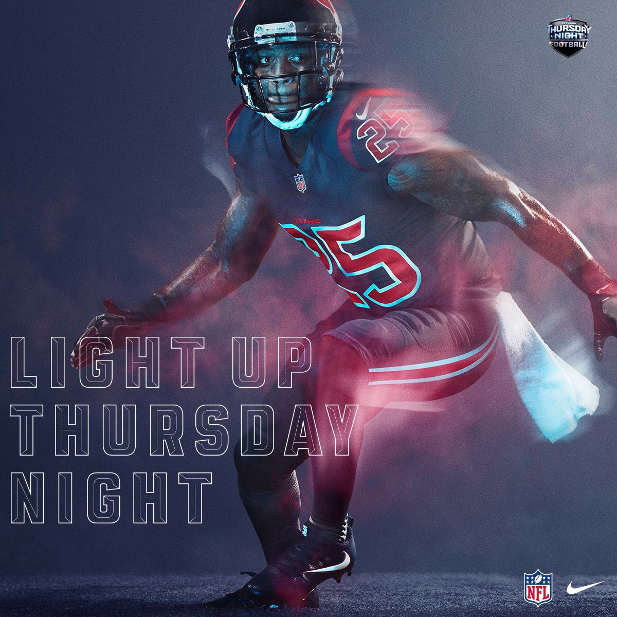
The color combo is great. So great, in fact, that nine other teams use it and the Texans can’t even wear it this year.
#21 – Titans
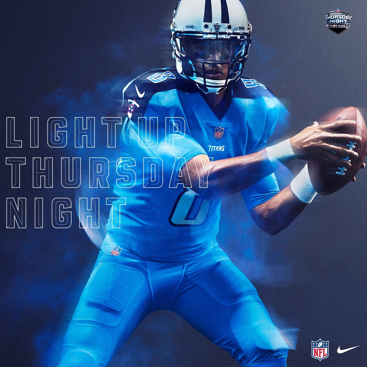
Everything about the Titans should be dated. They entered the league at a time when we were obsessed with cartoon logos and all things baby blue and teal. Somehow, they still look fresh though, if not boring.
#20 – Eagles
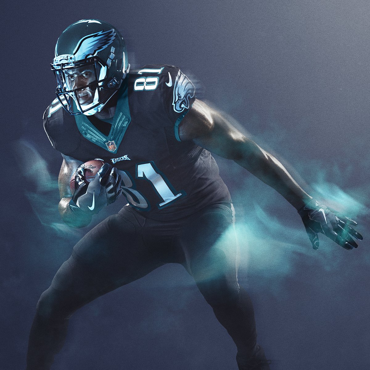
I hate midnight green. It’s not even a color. The black on black uniform is easily the Eagles’ best, and probably the best use of black in the league. The only reason it’s not higher is because we’ve seen it before.
#19 – Colts

A crisp, classic look that bores the hell out of me. I’m shocked that Jim Irsay didn’t somehow get this thing to be bright yellow with blue stripes and extra pockets for loose cash.
#18 – Patriots
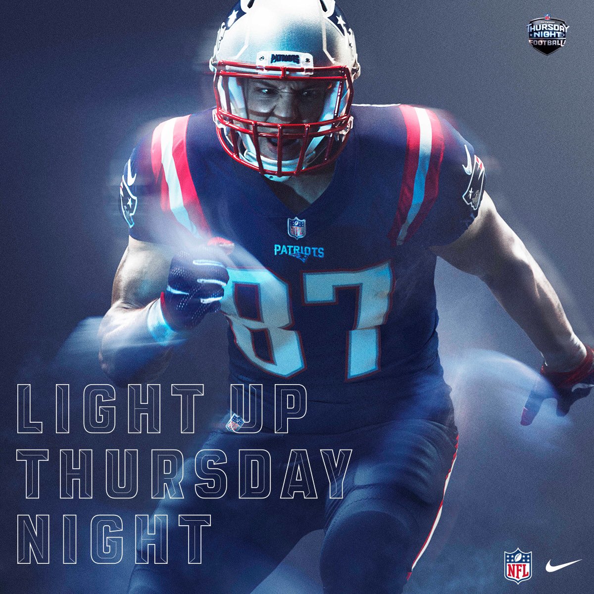
Texans did it better, but at least the Pats actually get to wear these.
#17 – Jaguars
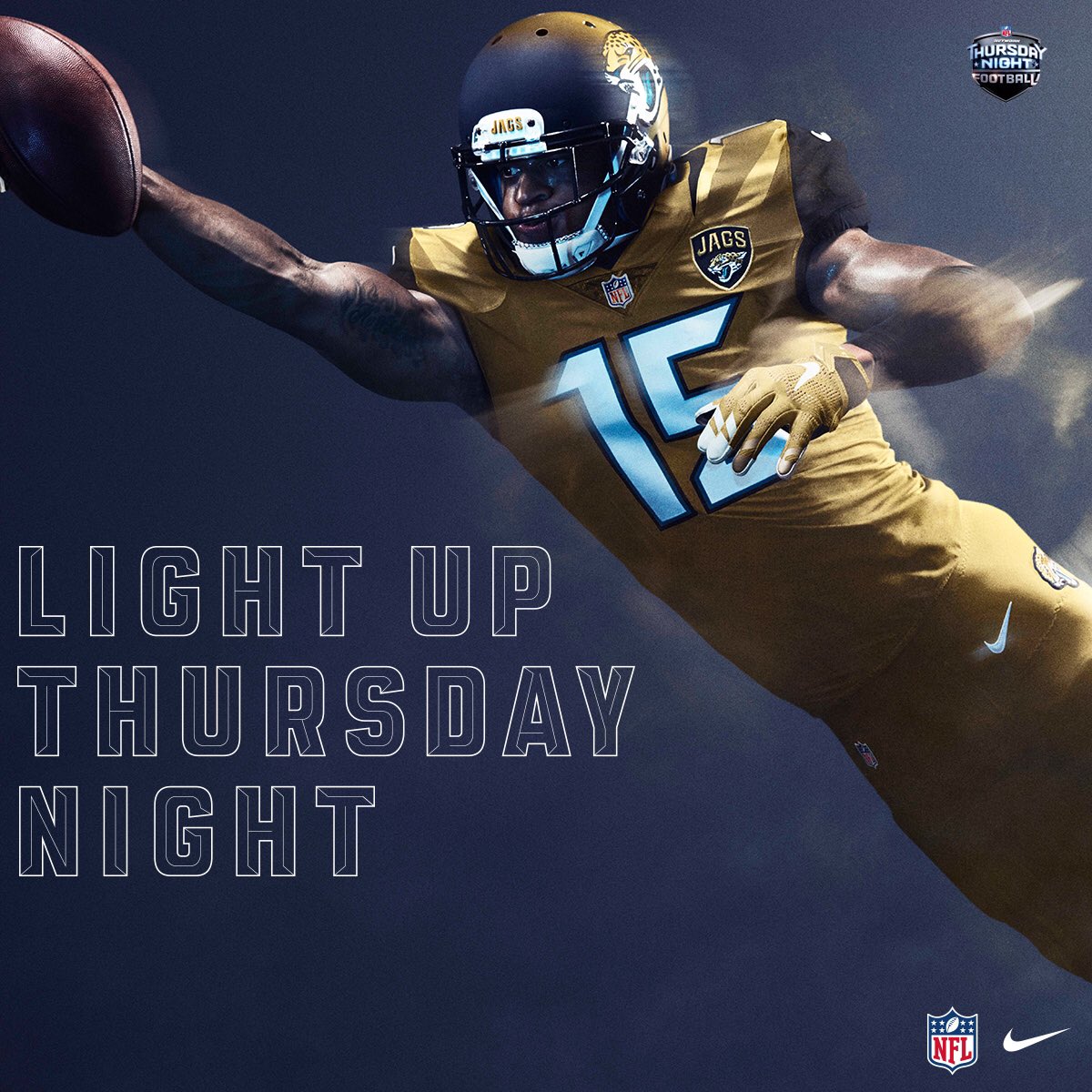
Maybe I’m coming to terms with the fact that we’re all tumbling towards our inevitable, ugly, destructive end, but for some reason I don’t hate this. The whole thing looks like a Gulden’s bottle, but Gulden’s is the shit. Their helmet is still the worst in league history.
#16 – Panthers
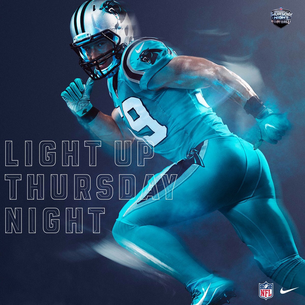
Another “how is this different” design, but the Panthers – as they’ve improved as a team – have really become one with their design. It’s not amazing, but they really could have screwed this one up.
#15 – Cardinals
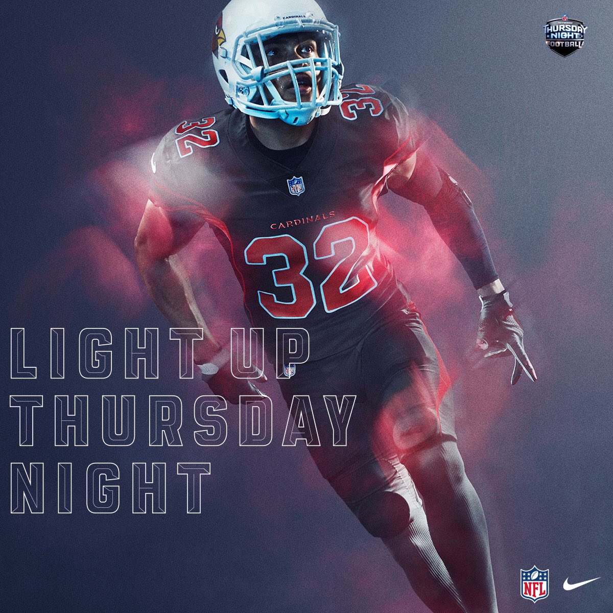
Niners did it better.
#14 – 49ers
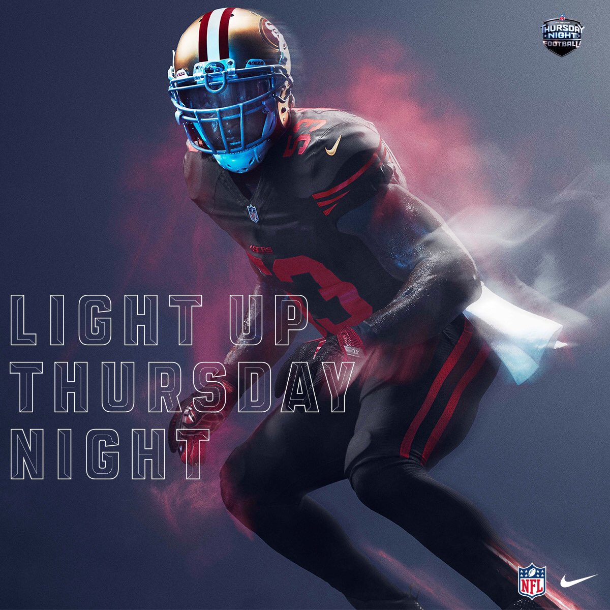
Cardinals did it worse. But here’s one of those situations where I wish the NFL allowed players to use an alternate helmet that would have some more red in it. It’s just their current alternate, but it’s relatively new and one of the better alternates in the NFL.
#13 – Dolphins
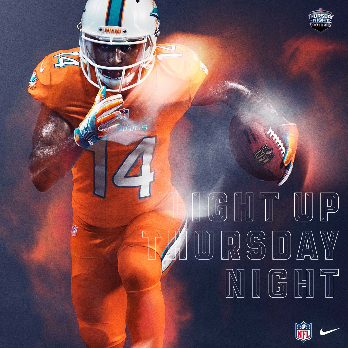
This is much, much better than the ‘Fins going all teal, and the only reason it isn’t higher is because someone else did orange better.
#12 – Steelers
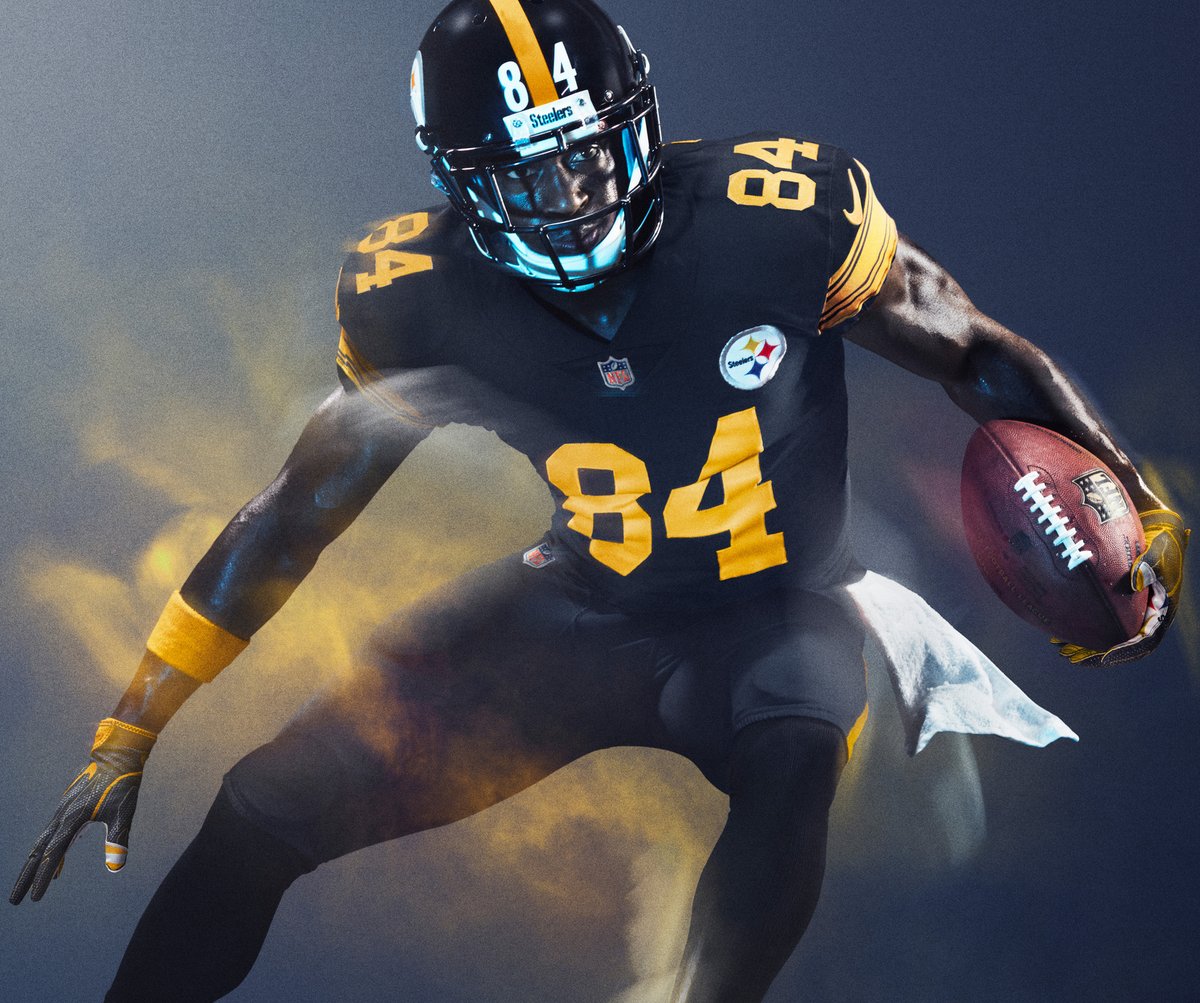
Man, I hate the Steelers. Everything about them, except their uniforms. And these made a huge improvement on their usual black unis by dumping that cheesy-ass number font. In fact, the blockier number font and big TV numbers on the top of the shoulders? This is basically an alternate-dimension Packers uni, and with GB sticking to their normal wears it’s a great addition.
#11 – Rams
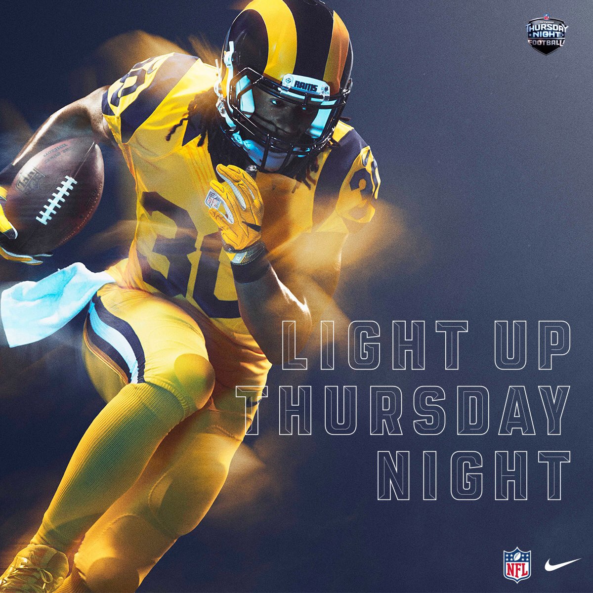
This should be their full-time uniform. The top 12 or so of these are mostly teams who took a good-looking uni, made a small tweak, and created a very cool one-off. But oh my God how is this not what they wear every single game? They wouldn’t even need a road jersey, it’d never clash.
#10 – Bills
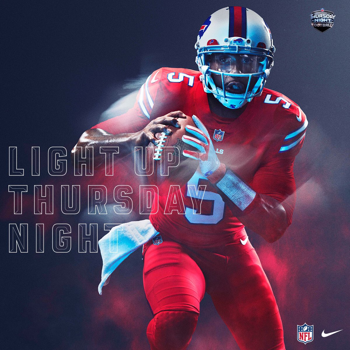
The Bills have one of the best looks in the entire NFL, and by recycling last year’s best color rush look, they hop right into the top ten.
#9 – Broncos
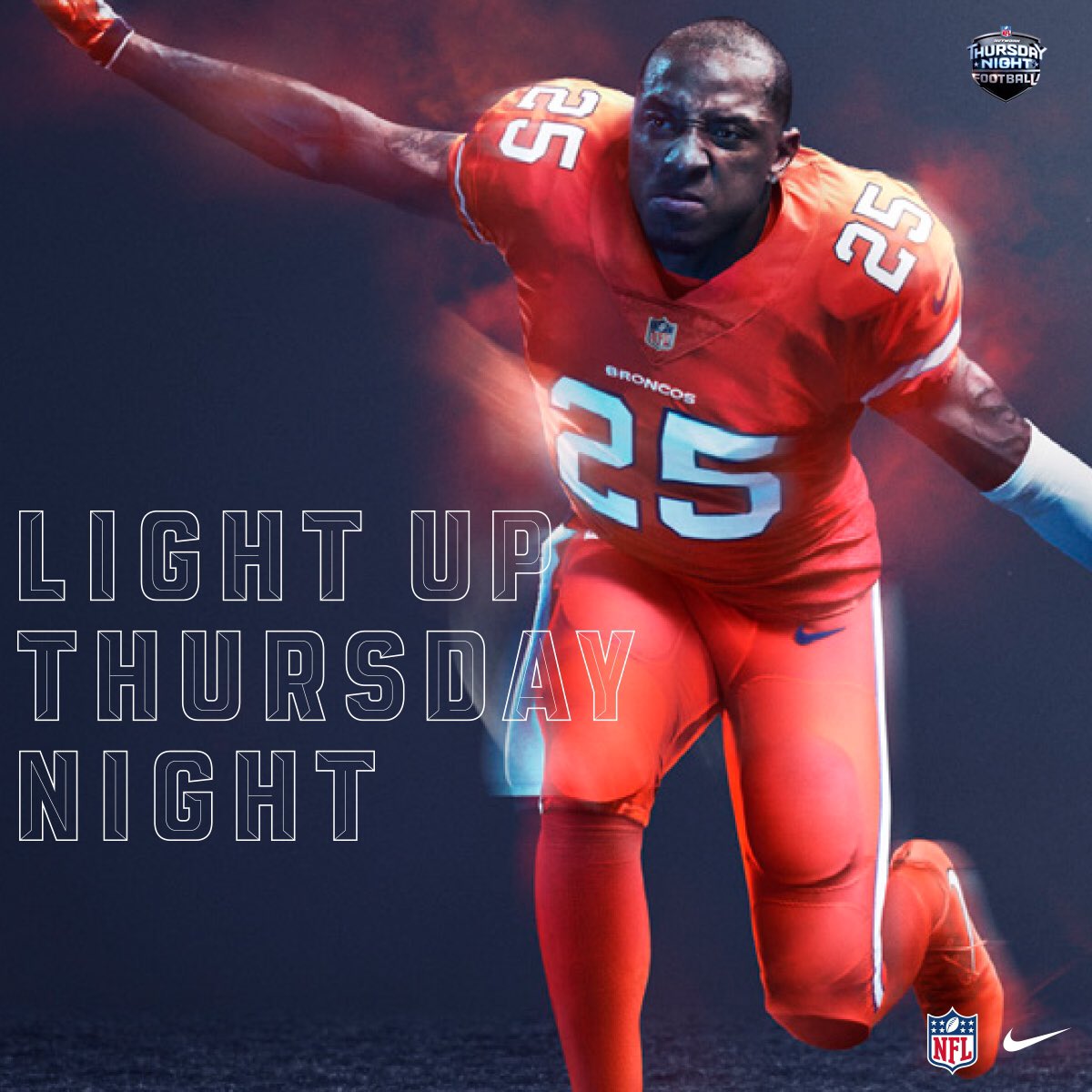
The Broncos single-handedly dumped the Dolphins down four or five spots by just showing how good Orange can look. They never should have left these behind.
#8 – Raiders
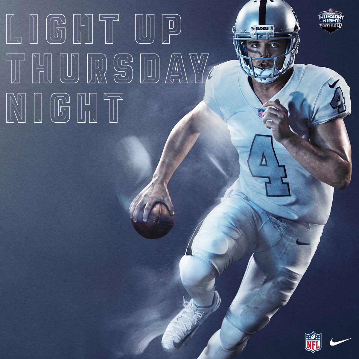
Basically their AFL throwback, which is one of the best in the sport.
#7 – Vikings
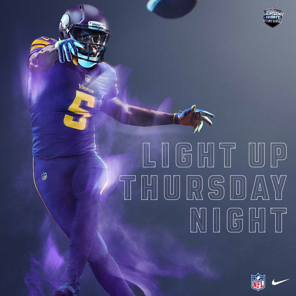
I’m just going to fully admit that these are terrible but I love them. Purple and yellow/gold is such a great color combination that I don’t even care that their dumb number font is down there with the Bucs. This is beautiful.
#6 – Ravens
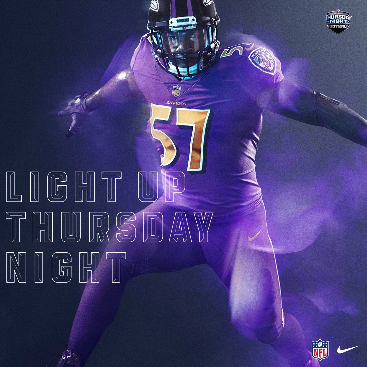
See literally everything I said above.
#5 – Lions
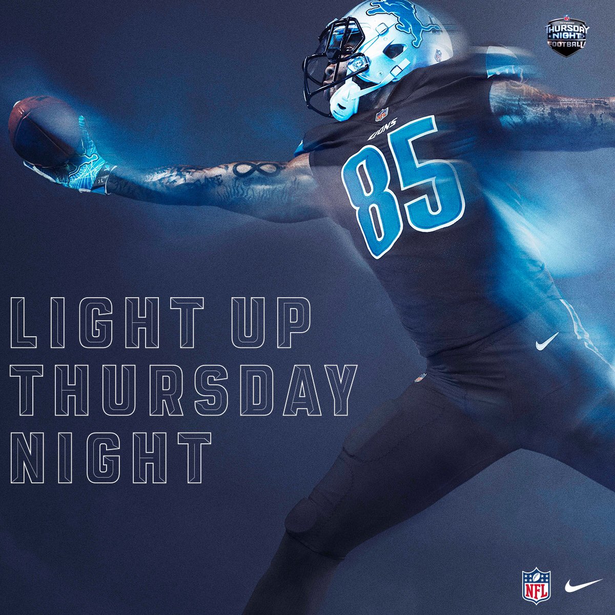
The league’s second-best black alt (behind the Eagles, but not worn nearly as often).
#4 – Bengals
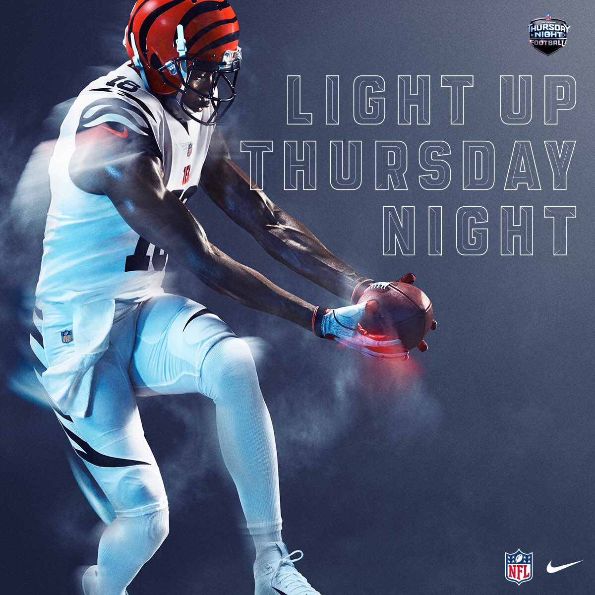
FINALLY, something legitimately interesting and different. This looks like some bullshit Jump Ball jersey from Starship Troopers, in the best way.
#3 – Falcons
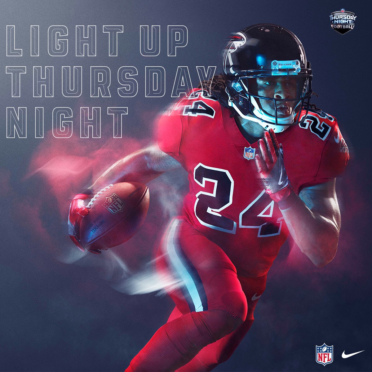
A modernized update of perhaps the best simple-but-deceased unis of all time.
#2 – Saints
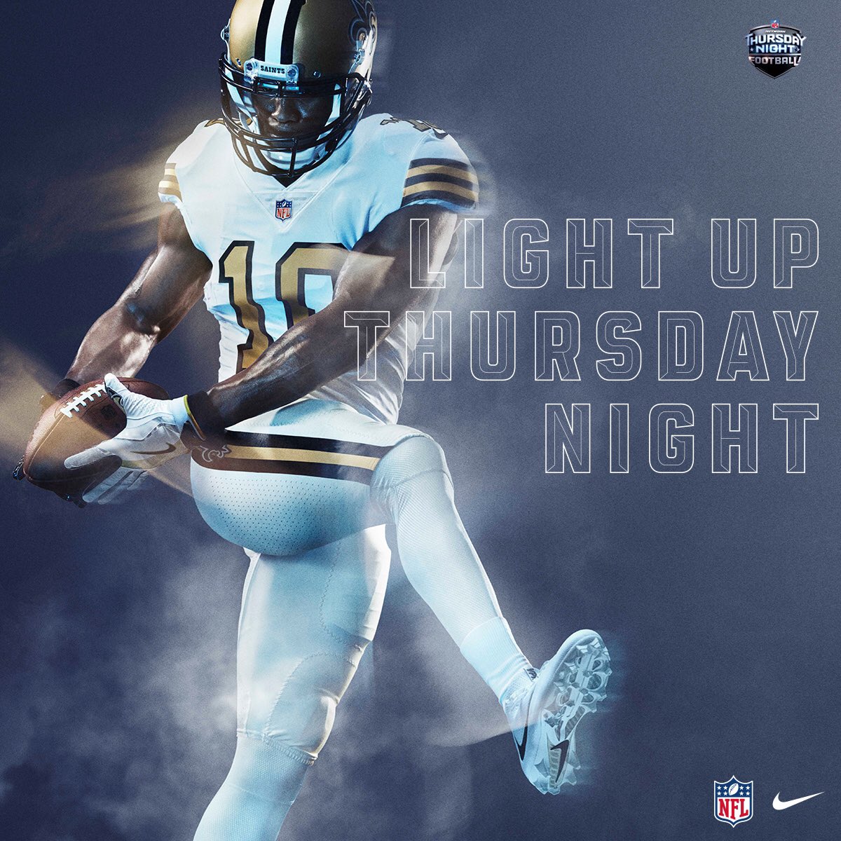
Another entry in the “why don’t they wear these everyday” category, that gold helmet actually looks like it’s PART of the whole uniform. Anything is an improvement on their gold pants, which haven’t looked good on any team in 30 years.
#1 – Chargers
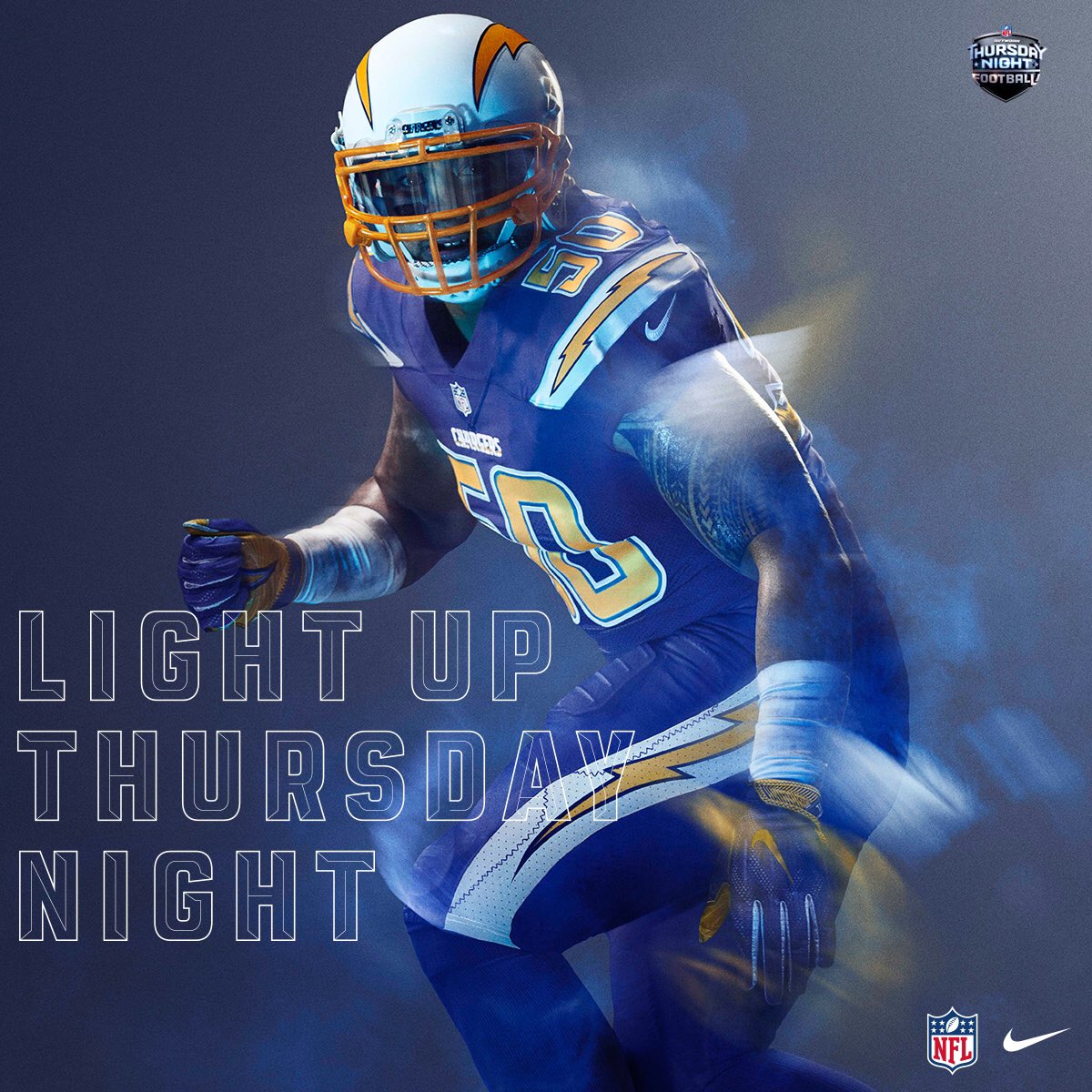
There’s gotta be some kind of metric based on comparing a team’s quality of home stadium vs. their uniform, right? Because the Charges’ home field is complete, total, and utter trash. Yet they consistently look amazing – especially in the baby blues that everyone loves – playing said stadium. These actually top those. Don’t even wear these every day. Don’t even wear them once. Frame them as the aesthetic ideal of what a football uniform can be.
Kyle: Jim is wrong. The Seahawks are number one by a wide margin. And he used the word “trash” four times and “garbage” once to describe uniforms. I edited out two of them. We’re expanding our vocabulary around here. Unacceptable.

When he's not writing about sports here or ranting about them on Twitter, Jim is probably watching X-Files on Netflix or drinking a beer somewhere. Jim has nothing against hockey, it's just not his style. He once met Duce Staley at a Sixers game.