
Ad Disclosure
The 2019 Phillies Special Event Hat and Jersey Roundup
By Dan Fuller
Published:
And they could all be a lot worse! For the last few years, it hasn’t been worth giving any grand pronouncements about the state of sport vs. merchandising (which was originally a discussion of sport and patriotism). These products come out every year, and I’m just an old man yelling at a cloud at this point. And new hats are always fun.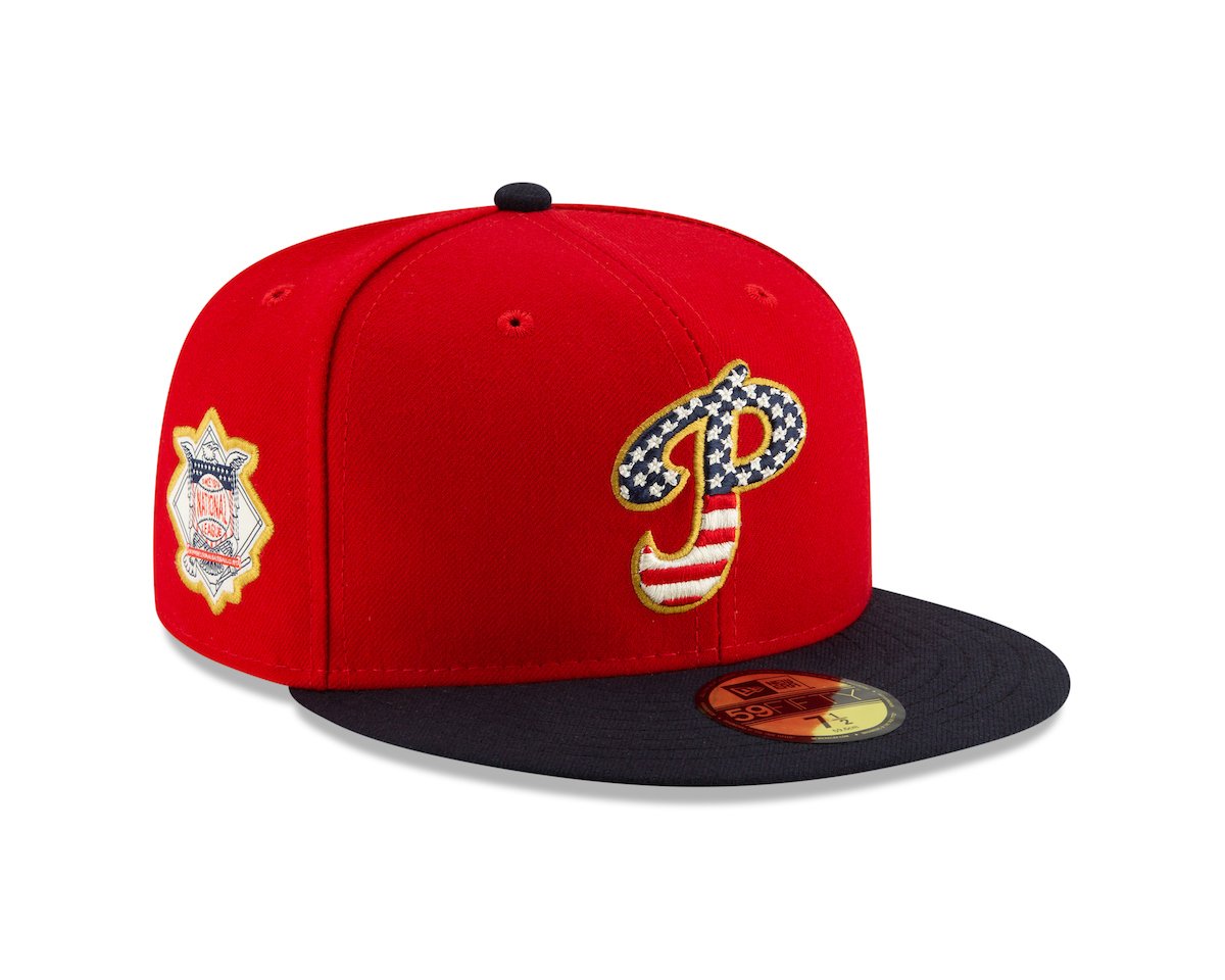
It’s not that bad!
We’ll start with the Stars and Stripes hat. Every year I think “What is possibly left?” And they always find something new. Here, instead of “what can we do with red, white, and blue,” we have the extraordinarily smart move to use a retro logo. And lots of points for picking the Whiz Kids era logo instead of the currently retro-chic 70s/80s logo. (“But Dan,” you say, “it could also be the 1934–37 logo.” It could be, but I think they’re going for the Whiz Kids. I like it. Even if it were the current logo, being that the new normal (note: it’s not new, we’re more than a decade into flag hats), it’s not that bad.
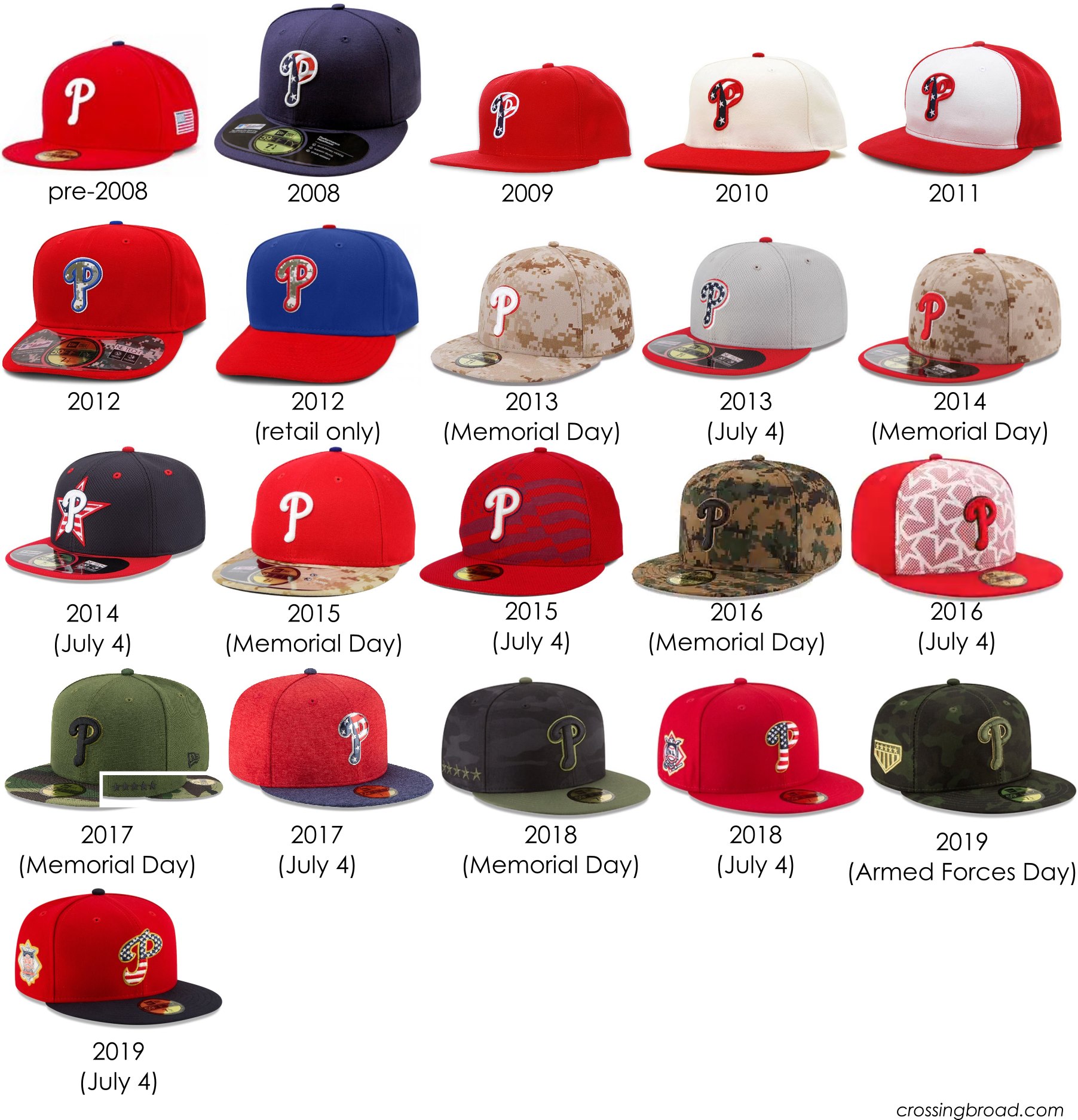
That’s a lot of hats. I still think 2008 is the best, with 2009, 2011, and the red 2018 being tied for second place. Notice that it’s now military-inspired/camouflage on Armed Forces day, not Memorial Day, which had been a (correct) concern about the accuracy of the civics of military symbology on Memorial Day for many of the previous designs, so give MLB credit for getting it right… assuming any of this is necessary for Armed Forces Day or Memorial Day. Memorial Day will be the normal hat with a patch over the left ear left chest on the jersey. Of note, other than jersey patches for some of the games, there are not special matching jerseys, unlike the last few years. That’s… another improvement.
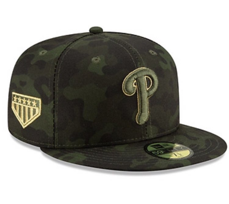 Like the last few years, If you need a camouflage Phillies hat, it’s certainly a Phillies camouflage hat. These were worn last weekend against the Rockies.
Rounding out the year, we’ve got Mother’s Day, Father’s Day, All-Star Game, and Home Run Derby/All-Star Batting Practice hats.

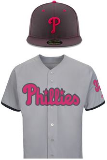
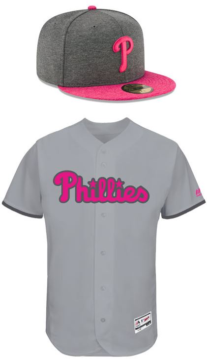
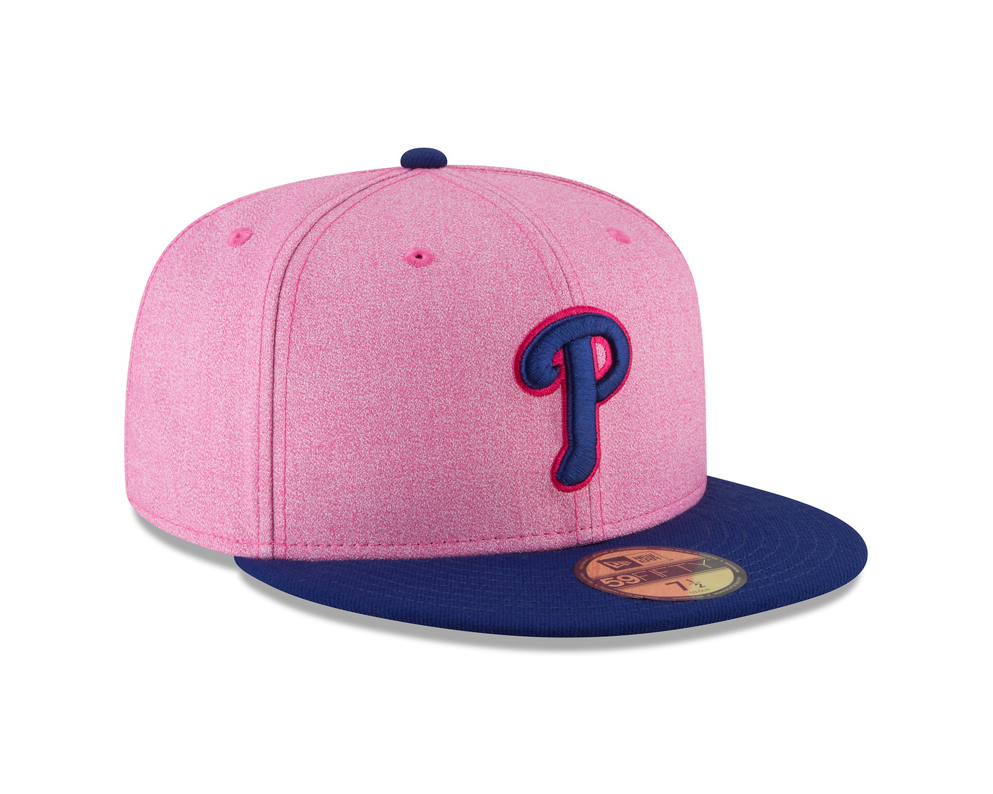
Alright – blue and pink. That’s something. A trip down memory lane shows that this might be the best version of the Phillies hat with pink so far. Being a shade of red, these worked quite well with the away jerseys against the Royals. Previous years’ designs shown below.
Cloudy, tie-dye blue for Father’s Day? Uh… sure. I’ve gotten used to the Stars and Stripes and camouflage hats as being “real,” but the Mother’s Day and Father’s Day hats look like something you’d buy on the boardwalk.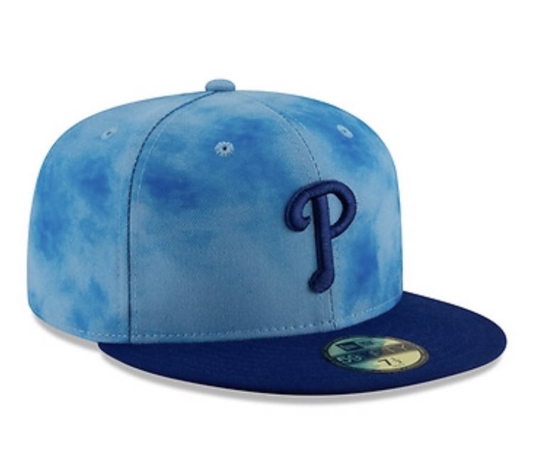
All-Star Game
 The red All-Star Game hat is great except for that wide, blue piping, and, for trivia’s sake, looks similar to the early 2000s Phillies batting practice hats with the stars next to the “P”. And the stars and that gold stroke around the “P” are gold. Nice.
All-Star Batting Practice/Home Run Derby
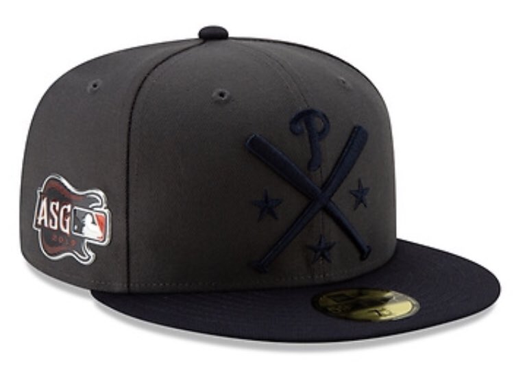 This one is the MLB being a few years late to the FauxHo-Rustic trend. Please don’t buy these. Heck, because the National League is black on (very) dark grey instead of the American League’s red on dark grey, you can’t even make out what’s on the hat. Blech.
Much more at Chris Creamer’s Sportslogos.net and thanks to Matt Breen who posted all of the images to Twitter.
If you found this interesting check out over nine years of articles like this one on this very website. After that, if you collected baseball cards in the 80s and early 90s (and don’t mind reading about teams that aren’t the Phillies), you may be interested in my baseball card project, The List of Fisk.
