
Ad Disclosure
ESPN Changed Their Monday Night Football Graphic in the Middle of the Game
Published:
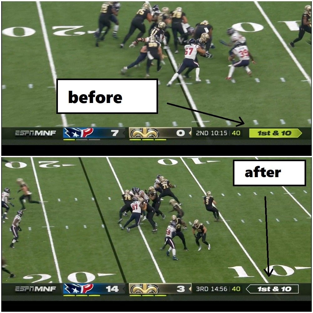
If you watched the Monday Night Football double header, you saw some popping new graphics on your TV screen.
ESPN rolled out a lower third chyron with the typical team logos and scores, featuring a separate graphic that showed the current personnel formation on the field. This is a new wrinkle for the season, the little line that appeared above the score and said something like this:
“one TE, one RB, three WRs, #10 DeAndre Hopkins, etc etc”
Interesting idea, though I’m not sure the typical viewer cares about that, do they? No clue.
Another new quirk was a bright yellow or neon greenish down and distance marker on the bottom right-hand corner of the screen, which really stood out during the broadcast and looked like this, via DubDotDUBBY:
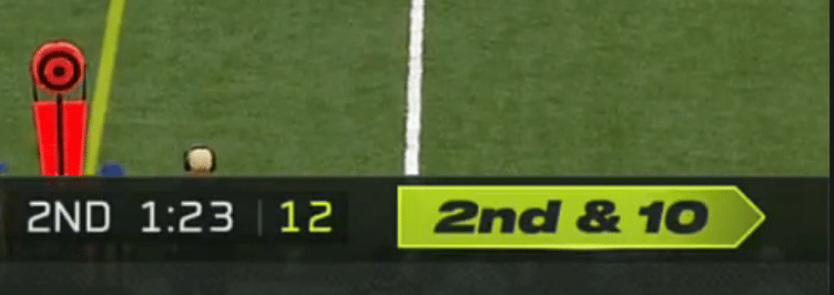
Problem here is that fans thought they were getting a penalty flag on every play. There was head-scratching and bewilderment. ESPN was showing an inversely colored yellow-on-black look when a flag was actually thrown on the field, which looked like:
The flag graphic is less yellow than the normal down-and-distance graphic. Incredible. pic.twitter.com/Q5aipeycPS
— Riley McAtee (@RileyMcAtee) September 9, 2019
Confusion! Confusion all around!
But to ESPN’s credit, they changed the damn thing at halftime of the Texans/Saints game. They didn’t wait at all; they saw the complaints on social media and came back in the 3rd quarter with a black and white version of the graphic, which blended much better with the lower third:
Our ESPN production team is aware of the feedback on the #MNF down and distance graphic. We have called an audible and adjusted for the 2nd half of #HOUvsNO and for the #DENvsOAK game to follow. New look pictured here. pic.twitter.com/SWLKKuW87w
— bill hofheimer (@bhofheimer_espn) September 10, 2019
There you have it.
This, my friends, is the power of Twitter complaining.

Kevin has been writing about Philadelphia sports since 2009. He spent seven years in the CBS 3 sports department and started with the Union during the team's 2010 inaugural season. He went to the academic powerhouses of Boyertown High School and West Virginia University. email - k.kinkead@sportradar.com