
Ad Disclosure
Indianapolis Colts Add a New Secondary Logo
Published:
Brand narratives are typically corny.
Some team will redesign their logo and then give us an in-depth graphic explaining all of the new things we’re looking at, with descriptions like “the circle here represents strength and unity,” or “five stars symbolizes the five rivers that Bobby McDermott crossed back in 1927 to found the city of Altoona.” Most of it is total malarkey, as Joe Biden would say.
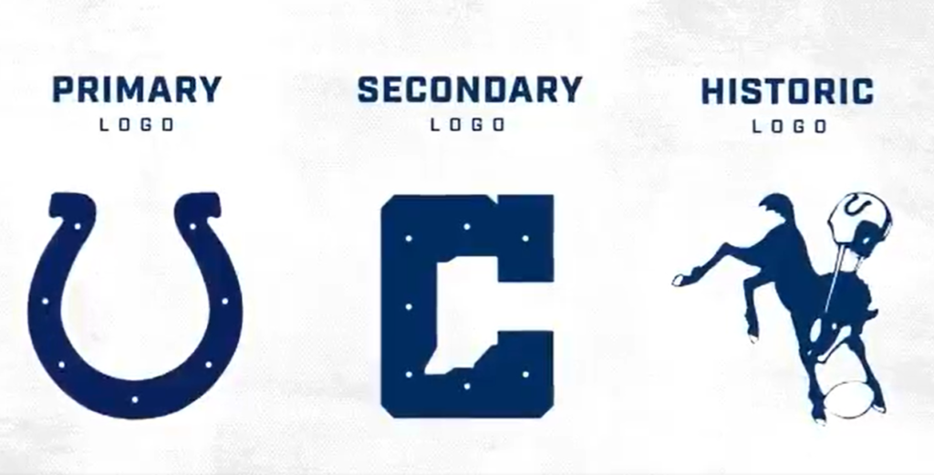
But the Indianapolis Colts… got it right? They released a new secondary logo today, an alternate design with the state of Indiana cut into the letter C, with the classic horseshoe grommets added in:
Honoring our past. Always evolving. pic.twitter.com/BBWqIG7p6p
— Indianapolis Colts (@Colts) April 13, 2020
I dig it. You’ve got the traditional horseshoe logo, so that’s not changing. Then they add the updated font and the secondary logo to honor the state without going overboard. This is a way to refresh the look and make it a little more clean and sleek while not deviating from the classic blue and white that the team wears.
Nice job by the Colts. Better than the LA Rams, for sure. And much better than this nonsense:


Kevin has been writing about Philadelphia sports since 2009. He spent seven years in the CBS 3 sports department and started with the Union during the team's 2010 inaugural season. He went to the academic powerhouses of Boyertown High School and West Virginia University. email - k.kinkead@sportradar.com