Ad Disclosure
It’s Official: Seattle’s NHL Team Will Be Called the “Kraken”
By Russ Joy
Published:

“Thar she blows” or something like that. I guess the Kraken doesn’t have a blowhole like a whale. Doesn’t matter. After months of speculation, the NHL’s 32nd member, an expansion team located in Pacific Northwest, will be called the Seattle Kraken.
https://twitter.com/NHLSeattle_/status/1286334190439395330?s=20
The History
There’s so much to dive into here. Let’s start with the origin of the name came from and when it was first referenced in Seattle:
Seattle hockey team will be called the Kraken after the Loch Ness monster like sea creature. First mention of the Kraken in Seattle was in October 1884. pic.twitter.com/CJDd2UFPJ8
— Darren Rovell (@darrenrovell) July 23, 2020
I will avoid the urge to eviscerate Darren Rovell -whose pompous musings on Twitter make me cringe more than realizing Disney did in fact make a Lion King 2 and Lion King 1 1/2- for his woeful comparison between the Kraken and Loch Ness Monster. I could, I arguably should, but I won’t.
For the purposes of today’s lesson on Nordic folklore, I’ll merely note that the Kraken was said to roam the icy waters from Norway, past Iceland, all the way to Greenland. The Kraken would haunt the seas, striking fear into the hearts of the unsuspecting crews of ships who may or may not at any moment see their ships enveloped by the beast’s tentacles and pulled to their death in the deepest depths of the sea.
The Sweaters
The sweaters that Kraken players will wear are pretty freaking awesome:
The white Kraken jersey is so clean. pic.twitter.com/zf410rhHfi
— Matthew Bové (@Matt_Bove) July 23, 2020
It’s an excellent, unique color scheme and the sweaters look really clean and crisp.
The Logos
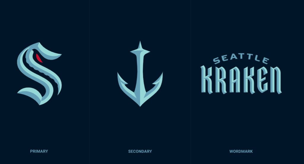
You will have undoubtedly noticed the primary and secondary logos by this point, both of which are deserving of some attention.
Primary Logo
The Kraken has been released!
From the designers at Adidas to team owners and marketing execs, here's the behind the scenes story of how the Seattle NHL team's name, logo, colors & branding came to be. https://t.co/cOLvxylok9 pic.twitter.com/KzAG6q9o8k
— Emily Kaplan (@emilymkaplan) July 23, 2020
The anatomy of the logo was a collaboration between the Seattle organization and Adidas. The red eye strikes fear in the heart of the weak, while the dark tentacle slipping its way up the center of the logo is a nice way to pay homage to the hidden, sneaky nature of the Kraken.
Secondary Logo
The coolest part about the secondary logo, an anchor, is the Seattle Space Needle being beautifully adapted.
The Seattle Space Needle in the Kraken's secondary anchor logo is just *chef's kiss* pic.twitter.com/NOO8Oh73Dl
— Ryan Hana (@RyanHanaWWP) July 23, 2020
To be honest, I get real Seattle Mariners vibes from a color scheme and nautical standpoint, but the designs are unique enough to avoid a direct comparison or accusations of ripping off a fellow city team.
The Kraken certainly beats another rumored name: the Sockeyes.
Russ Joy hosts The Russ Joy Show, Snow The Goalie: A Flyers Podcast, and It's Just Wrestling Podcast. He's blogged about Philly sports on Crossing Broad since before the Eagles won a Super Bowl. A graduate of West Chester University of PA and California University of PA, Russ is also a husband and father of four. Follow him on Twitter: @JoyOnBroad