
Ad Disclosure
Phillies Release City Connect Uniform, Earthquake then Hits the Region
Published:
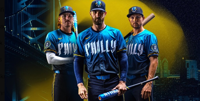
Did anybody just feel that earthquake? My house shook in Montco. Not coincidentally, it happened right after the Phillies released photos of their players wearing the new City Connect uniforms:
An ode to Philly’s past, present & future.
➡️ https://t.co/5ZsDu5BBDu pic.twitter.com/RGnXRnl3zC
— Philadelphia Phillies (@Phillies) April 5, 2024
The Phillies’ City Connect uniform is HERE 🔔
Unapologetically Philadelphia, this is an ode to the city’s past, present and future pic.twitter.com/biSZLmh58j
— MLB (@MLB) April 5, 2024
The only thing that I’m on the fence about is the Spinal Tap-looking font, but these are fire otherwise.
Here’s the description from the press release:
COLORS A CITY CAN RALLY BEHIND: From light to dark — Philly has always been a place unafraid to revolutionize, start anew and work hard to make change. Blue and yellow are based on our city’s flag, unchanged since its inception.
A COLLAR THAT’S NOTABLY BLUE: The skyline of Philadelphia is proudly depicted on the inside of the jersey’s collar. Most notably, however, is the bright blue shade of the collar — intended to represent what Philadelphia is at its core: a blue-collar big city with a small-town feel.
PHILLY CRACKED PATTERN CHESTPLATE: The pattern is reminiscent of text found on important historical documents in the city and features a subtle pattern inspired by the crack of the Liberty Bell.
OUR HEART ON OUR SLEEVE: The sleeve patch features “City of Brotherly Love” with the iconic Liberty Bell integrated within the word “Love”, a nod to both a symbol and word that is strongly held at the heart of Philly. On the interior, an etching pattern references the illustration style featured in literature common around the time of the revolution. Baseball laces woven into this detail are intended to represent how deeply the Phillies are stitched into Philly’s DNA — a testament to how impactful the game is to the fabric of our city.
CAP FEATURING A BELL TO BE RUNG: The cap features our iconic Liberty Bell and skyline with two stars representing the stars in our traditional Phillies logotype. The undervisor and sweatband features filigree inspired by etchings on the Liberty Bell, and its placement reinforces that revolutions happen underground, a common theme in our city’s history.
Yeah listen, the “brand narrative” makes sense here. There’s a meaning behind everything in the uniform. It’s not like they just threw some shit at the wall and hoped for it to stick.
Baseball traditionalists and boomers alike (a Venn diagram comprising a flat circle) will complain because they complain about everything. It’s tacky, it’s not traditional Phillies colors, it’s got too much personality, blah blah. They like gray and white and other assorted boring shit. Baseball needs more personality. We need bright colors and Victus bats and cool hats. There are 162 games and plenty of times to wear multiple uniforms of various colors. Throwing these into the mix hurts nothing. Stuffy baseball complainers must embrace new things, with arms wide open.

Kevin has been writing about Philadelphia sports since 2009. He spent seven years in the CBS 3 sports department and started with the Union during the team's 2010 inaugural season. He went to the academic powerhouses of Boyertown High School and West Virginia University. email - k.kinkead@sportradar.com