
Ad Disclosure
Here Are the Flyers’ Stadium Series Jerseys
By Kyle Scott
Published:
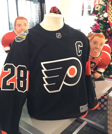
OK so they look a little bit better than the version we saw yesterday and a lot better than the 50th anniversary embarrassments. I don’t hate them. I could learn to love them. I’ve always like the black jerseys, and still like the original blacks better, but these aren’t bad. Big, bold numbers and colors, though I could use some more accent and piping around the name and numbers:
The moment you've all been waiting for…
The 2017 Stadium Series jersey is here! Make it yours → https://t.co/AIRqMA0c7p https://t.co/bA3OOdkEcL
— Philadelphia Flyers (@NHLFlyers) December 10, 2016
Here’s how the Flyers describe them:
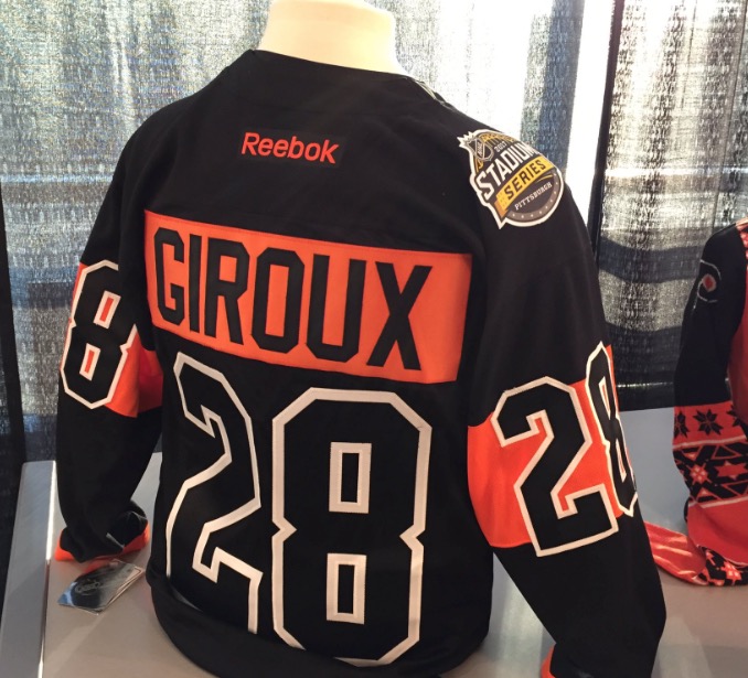
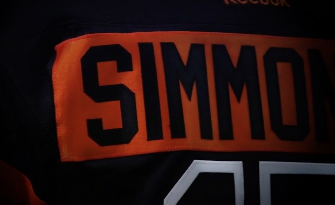
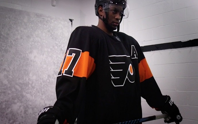
The new jersey stands as a contemporary homage to the unique characteristics of 50 years of the Flyers uniform – a bold design for a passionate city. The primary color of the uniform is black, fiercely showcasing the traditional winged-P on the chest. The single dominant orange bands are a reinterpretation of the singular bands of color on the team’s current home and away uniforms. In addition, these bands of color are complemented by a contrast color name-plate, which is a signature design feature of the Flyers’ NHL uniform.
The full uniform carries the theme of orange accents over solid black – black socks showcase a single orange stripe across black, gloves include orange highlights, and the black helmet includes numbers mirroring those on the jersey.
Fiercely showcasing the traditional winged-P on the chest. I gotta hand it to whoever wrote this to describe just using the logo.
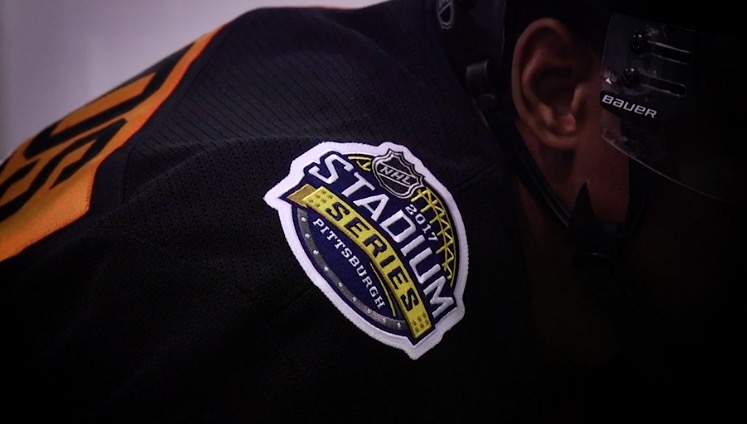
Here are some more pics:
I feel like fashion editor Dan is going to have some thoughts here.

Kyle Scott is the founder and editor of CrossingBroad.com. He has written for CBS Philly and Philly Voice, and been a panelist or contributor on NBC Sports Philly, FOX 29 and SNY TV, as well as a recurring guest on 97.5 The Fanatic, 94 WIP, 106.7 The Fan and other stations. He has more than 10 years experience running digital media properties and in online advertising and marketing.