
Ad Disclosure
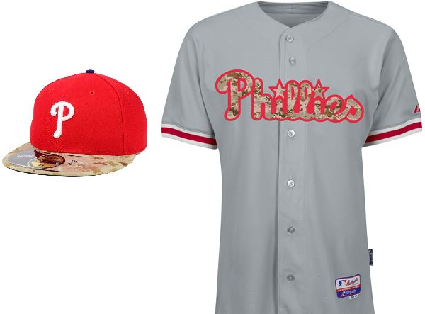
The Phillies 2015 Memorial Day Hats and Jerseys are Here
By Dan Fuller
Published:
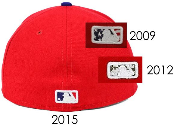
Each year, I have less and less to say about these. They’re here to stay, and each year, it seems like “What’s left for the camouflage treatment?” This year, it’s the brim (last year was the crown of the hat). Next year: the button (“squatchee”) on top? And because this is the internet, I’m not done complaining. In previous years, a neat detail of these hats was stitching the special flag or camouflage pattern in the batterman logo. They’re just using the normal team colors this year. Boring.
Another interesting detail is on the jerseys; last year, the “camo’d” jersey was the pinstriped home version. 2013 and this year are the grey aways. Oddly, the 2013 used white stroke around the “Phillies” wordmark, like the normal away jerseys. The 2015 uses red stroke. I’d hate to think that this is solely to make them different than the 2013s, and this is a marketing exercise. I’d certainly hate to think that. And, it’s a visual mess because it doesn’t offset the camouflage from the grey the way the white does.
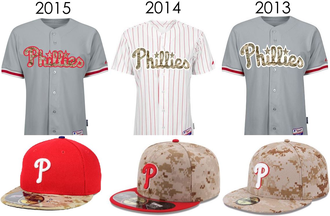
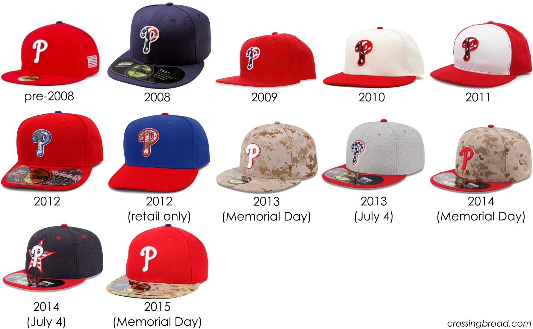
With all these variations of hats, we now have a continuum of “bad.” 2008, 2009, 2011 get passes as they basically look like regular hats drenched in sweet, sweet, freedom (red’s already a team color, navy is close enough to blue, also a team color). 2010: yuck. Among the camouflage options, 2013 Memorial Day has ended up looking the best, as it’s fully committed to the look. The 2015 gets the slight nod (hats, get it? ugh) over the 2014 due to the marginally subtler application of the camouflage concept. 2012 is so subtle that it just looks like a dirty “P.” Wrapping up the flag designs, 2013 gets points for originality, and 2014 is just a mess.
h/t: uni-watch
h/t: @fittedelphia for reminding me about the pre-2008 design last year.
