
Ad Disclosure
Unidiction: Reviewing The New Sixers Jerseys
By Dan Fuller
Published:
Jim was there, Kyle added another item to his list of things he loves about the Sixers ownership group, so what’s left? Lots! And in Question/Answer Format!
Are they nice?
Yes, they’re nice. That’s about it, though. Definitely not “great,” but they’re a very nice logical extension of the current uniform design.
Just “nice?” There are so many glowing comments about them!
Well, for one, they’re not the monstrosities that the Clippers unveiled the same day. For two, they succeeded in the very difficult “it ain’t broke, but we fixed it anyway, yet it came out better than when we started” design challenge. Really, though, they’re nice, and that’s kind of a win. Kind of. In the vein of wins that aren’t wins. Like managing to somehow not have the worst record of the 2014-15 season. But for those acting like these uniforms are the direct replacement for something as bad as the early 90s clownsuits, take a deep breath. They’re not even replacing something like the generally acceptable but forgotten mid-90s uniforms. The existing uniforms were also nice, but I wouldn’t argue too strenuously if someone told me they were boring. The new uniforms are not boring.
These new uniforms look a lot like the most recent jerseys, right? Everyone is talking like these are some giant step forward for the team.
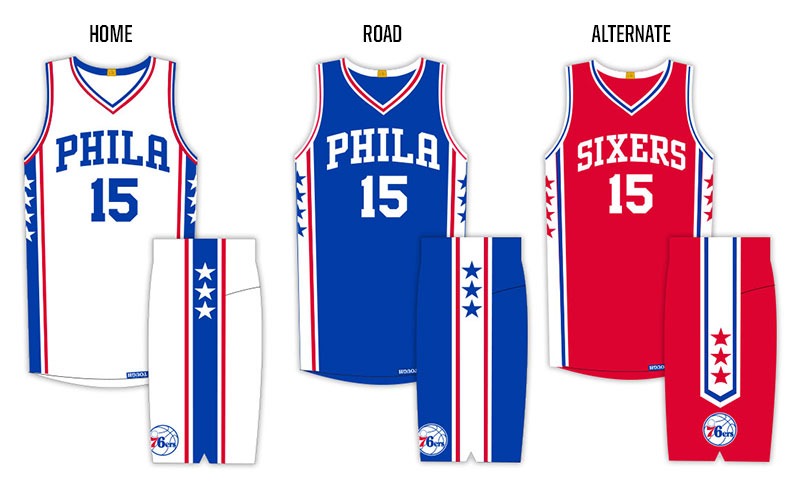
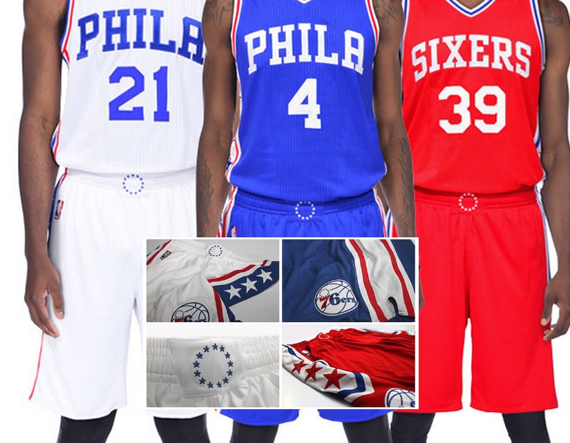
You’re right. These are remarkably similar to the uniforms worn since 2009. Non-fussy, old-timey gym class typeface on the front, base material one of red, white, or blue, numbers horizontally centered below the wordmark… you know, the Sixers retro-ish look they’ve worn for six years. BUT, they’ve emphasized “PHILA” text, with “SIXERS” relegated to the alternate, and added some pretty nice details to the side panels of both the jerseys and and the shorts. Again, they’re a nice destination from the starting point of the current uniform. They definitely have more flavor than what they replaced.
So, the city name will be on the primary home jerseys, not the team name?
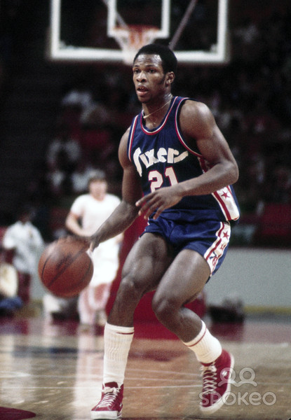
Yep. Call me old, but I prefer the baseball (almost-)standard of team name on home jerseys, city name on aways, but this is not a hill on which I need to die. It’s fine. There’s plenty of history of the Sixers wearing “Phila,” and in the right circumstances, I’ll even accept nostalgia without qualification.
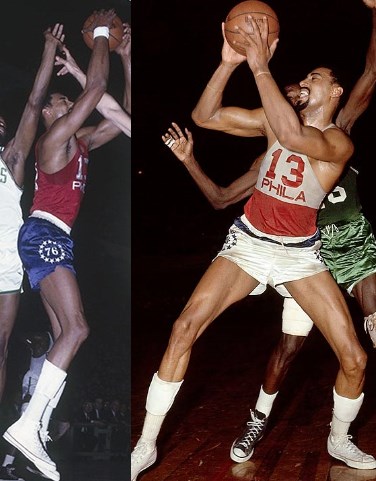
So, these snazzy, starry side panels– they look familiar.
You’re right; they do. But they didn’t think of using a different number of stars on each side back then.
Wait, what’s this about mismatched stars?
Well, the fault in their stars is intentional. A total of seven on the player’s right side, six on his left side. 76(ers). Or 7+6 = 13, the number of wins they’ll have next season. What? Everyone at Crossing Broad is supposed to be on-board with “the plan?” Fine. 7-6 = only 1 Sixers. Together We Build.

But the hidden PHILA TOUGH tag along the hem is pretty neat. It makes me feel like I’m [rebuilding] with the team.

But you’re not part of the team. You’re just some schlub paying $90+to wear someone else’s name on your back, and you’re now being marketed at with details specifically designed to make you feel like you know the secret clubhouse handshake. “Look at this cool ‘PHILA TOUGH’ detail which only the players can see!” It’s like you’re in the locker room and not the target of a checkbox in modern uniform design and marketing. Of course, this is also accompanied with the marketing copy trumpeting up just how subtle this feature is. So subtle that it was the first adjective used to describe it. Then, a description of how it was “…stitched upside down, situated to be legible to Sixers players as they tuck in their jerseys.” Note: they’ll also see it if they need to go the bathroom during the game. #INSPIRATION. Sure, it’s harmless aesthetically, and this is becoming excessively mean, so let’s move on.
You bloggers are so negative. If it’s so bad, what would you have done differently?
Hey! I keep reiterating that it’s nice; I’m just not as overwhelmed as Jim and Kyle. A super quick improvement: use red numbers on the white jersey, like the current white jerseys (and the Dodgers). This gives a nice pop on the white set. But for doing it differently, the 60s two-tone/panel uniforms would be an interesting jumping off point for a new uniform, and it already has “PHILA” and stars…
Any more positivity emanating from your mom’s basement about this?
Yes! For once, a big uniform unveiling has been solely about the design itself. This wasn’t the typical Nike NFL launch where it’s littered with Nike-speak among the descriptions of the various components. No “45% lighter, 30% more breathable” nonsense; just a full description of all the design elements of the new uniform. I can be (and have been) tough on marketing-speak, but watching a team unveil a new uniform, it’s expected. Their product is the team, and the uniforms are part of that brand. Watching Nike use the captive audience as an opportunity to turn the team’s event into a Nike commercial is borderline offensive. Even the hype video, often the refuge of the 50:50 team/apparel maker sales pitch was exclusively about the team, not the team’s outfitter. Does this have something to do with 2015-16 being the last year of the Adidas contract? Maybe. Will Nike pound us all over the head with Nike-speak (Flywire, Hyperknit, Hyperfuse…) every chance they can get when they then take over the contract? Absolutely. [note: I’m not giving Adidas a free pass here. Their NCAA Football hype work is just as bad as Nike’s; it’s just that this was a nice change of pace that the apparel maker was simply, you know, making apparel, not looking for ways to get a team to showcase their latest fabric technology and cross-category buzzwords.]
Anything else interesting?
Actually, yeah. Check out the 13 stars on the waistband. One star for every 2015-16 vict…[EDITOR’S NOTE: STOP IT]
UPDATE: Kyle: I just have to point out how amazing this comment was:

