Ad Disclosure
Let’s Talk About CSN’s Awful New Web Design
By Kyle Scott
Published:
This is not a Philly-specific effort. Four of the sites in Comcast-NBC-Universal-Telemundo’s stable of regional sports sites have upgraded to the new look. As Michael Barkann would say, let’s talk about it!
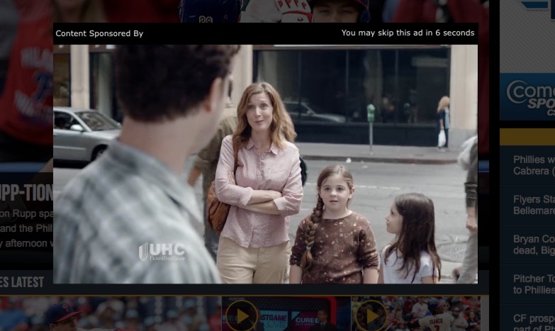
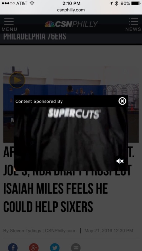
Upon loading up CSNPhilly.com, we’re met with the familiar NBC Sports dark backdrop… and then usually by an autoplay video ad:
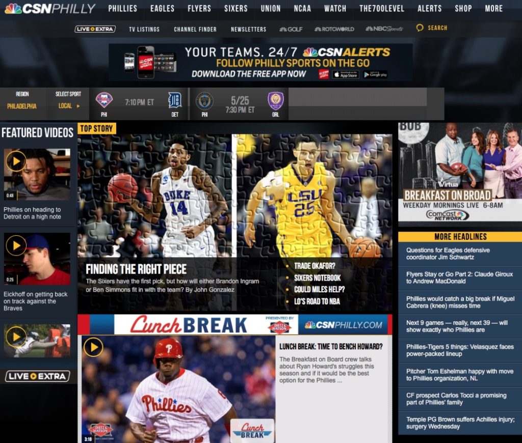
The homepage, which can best by described as “modern Angelfire,” is stuffed with, um, stuff. Mainstream sites foolishly believe they have to put EVERYTHING on the homepage lest they miss an opportunity for a click or to sell you something. Certainly, my preference of less is more – ads and surveys not included… – does not scale to a large outlet like CSN. They are expected to cover virtually everything, whereas sites like this one can cherry pick the most interesting stuff. With the greater responsibility comes the more difficult task of formatting and prioritizing it. I have sympathy for the person or people who have to do this, but there’s no restraint in what is obviously a corporate mandate to SHOW THEM EVERYTHING. Putting links to 100 different videos and stories is one thing, all this stuff is another:
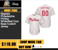
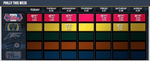
FANTASY PLAYER NEWS! BUY A JERSEY! TEAM SCHEDULES! NBC NEWS! WACKY WAVING INFLATABLE ARM-FLAILING TUBE MAN! It’s just too much.
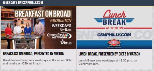
This is what happens when corporations get in the way of their own product. There’s plenty of good content on CSN Philly. There’s Reuben Frank and Jim Salisbury, Phillies press conferences, The 700 Level clips (I’m bred to hate The 700 Level, but Gonzo’s fun videos are easy to digest). That’s all worthwhile stuff. The problem is, because Comcast is so damn greedy and also somewhat disconnected, you have to find it through a thicket of virtual shit. No one gets their fantasy updates from the right rail of CSNLocal.com. Including NBC 10 updates is just a synergistic waste of space. Ditto for the apparel sales.* The assumption that readers don’t have easy access to sports schedules in any number of ways – “Hey Siri, when is the next Phillies game?” – is borderline insulting. And thank God they let us know that Breakfast on Broad is on tomorrow morning– I was worried for a second that it might not be on in the morning. Phew!
It’s mobile friendly… after a word from our sponsors
As for the design itself, they clearly went for large, mobile-friendly tap targets. That’s fine. Smart, even. But the layout still looks more at home on an iPad than an iPhone. I wonder if anyone at CSN bothered to notice than tablet traffic has pretty much plateaued at around 10%-15% over the last few years. The layout looks like a 2012 tablet app’s wet dream. Perhaps that’s when they started developing it.
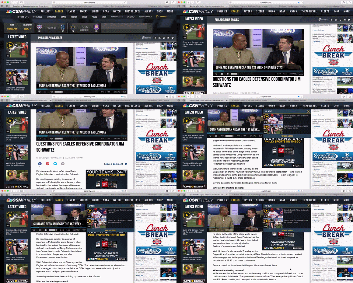
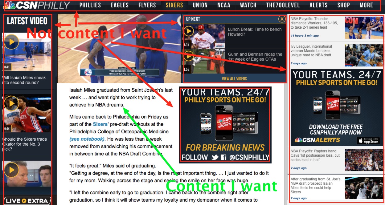
The article view is, thankfully, much better OH MY GOD IT’S NOT IT’S WORSE:
I’m using a 21-inch iMac with my Safari window taking up a sizable portion of the screen and yet the article itself is still small and almost feels like an afterthought with all of the junk surrounding it.
The relatively new trend of including autoplay videos with text articles would be maddening if it wasn’t so incredibly dumb. This is the disconnect between people who have worked in media their entire life and people who work normal jobs. The latter might choose or be able to watch sports and entertainment videos at work, but that doesn’t mean they can always withstand an autoplay video onslaught when they think they’re quietly browsing the web. I’m sure someone at Comcast (and ESPN– they do this too) who is paid to watch sports videos for a living thought this was a great way to leverage #video #content and goose ad revenue. The problem is that most people don’t work in an environment where they can just instantly consume video content at the drop of a hat, even if they wanted to (which they don’t). We’re in this weird world where everything is moving toward video and audio with complete disregard for that fact that sometimes just text and images are appropriate.
Of course, as stated, the reason for autoplay videos in text content (say nothing of the focus on videos everywhere else on the site) is to serve more video ads, which pay more than standard web ads. It’s nothing more than greed. CSN often literally double dips by showing you an autoplay video splash ad and then another autoplay video ad embedded in the article. Video ads are fine, but publishers are doing to them what they did to ad banners before– watering down the market with inflated, low-value impression counts that do nothing more than annoy readers and scam advertisers.
I’m not totally above this – we’re going to have some on the site soon, sans audio – but at a certain point they have an inverse effect, and I’d argue that point is littering every page and every click with distracting, loud, and in-your-face autoplay ads that push you away from the site. It’s a delicate balancing act, and CSN has long toppled off the edge and splattered themselves all over the shameful abyss.
Things I like? Um, the video player (when you actually choose to watch video) is nice, seems to work well. Actually, that’s it. That’s the only thing I really like. Anything that might otherwise be welcomed – including decent Reuben Frank articles – are muddled by horrible article formatting and awful, truly awful video content created for the sake of having video content. But the redesign doesn’t completely suck only because the previous design was just as bad. Gross.
*I used to manage the CBS Sports Store while at GSI Commerce. They did, like, single thousands per day in sales (revenue). That’s nothing for a large company. It’s almost a waste of effort. For comparison, I’ve had a number of days where I’ve done more than that on CrossingBroadStore.com. Me, one guy– it’s still not that much, but wholly more impactful for a small business than it is for a major media corporation. If I had to guess, selling Phillies jerseys and other local apparel on CSNPhilly.com nets Comcast about $4,000 per year, probably less.
Kyle Scott is the founder and editor of CrossingBroad.com. He has written for CBS Philly and Philly Voice, and been a panelist or contributor on NBC Sports Philly, FOX 29 and SNY TV, as well as a recurring guest on 97.5 The Fanatic, 94 WIP, 106.7 The Fan and other stations. He has more than 10 years experience running digital media properties and in online advertising and marketing.
