
Ad Disclosure
CB EXCLUSIVE: Here Are The Sixers’ New Red Uniforms
By Kyle Scott
Published:

Earlier, noted uniform expert and CB designer Conrad Burry tweeted a screenshot from NBA 2k18 showing off the Sixers’ new red jerseys, this after a grainy image of what looked to be the Sixers’ new jersey surfaced last week.
JUST IN: Via 2K, confirmation of the Sixers red alternate uniform design. I like it better than my two ideas. Nice 👍 (h/t @JMoneyMikita) pic.twitter.com/0H22F56nlR
— Conrad Burry 🔴🐐🎨 (@conradburry) September 13, 2017
That looks about right. I obtained glossy images of the new uniforms, and they are straight torches in the desert. In other words, hawt:
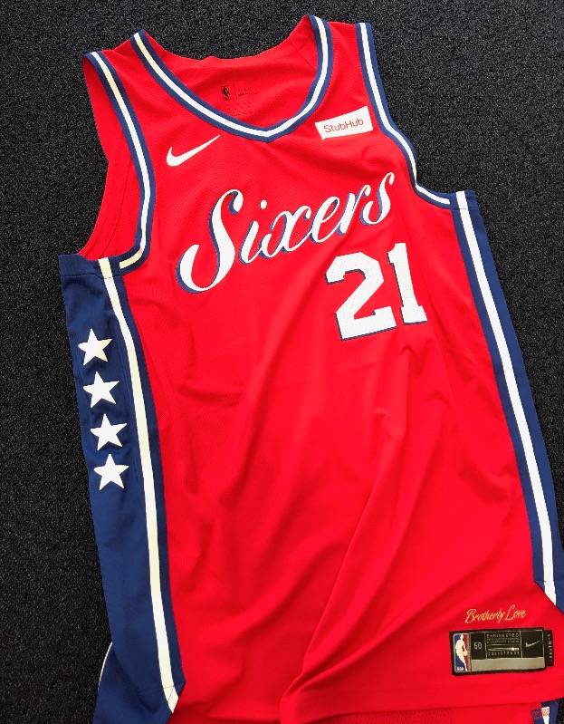
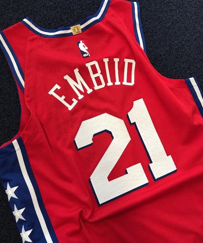
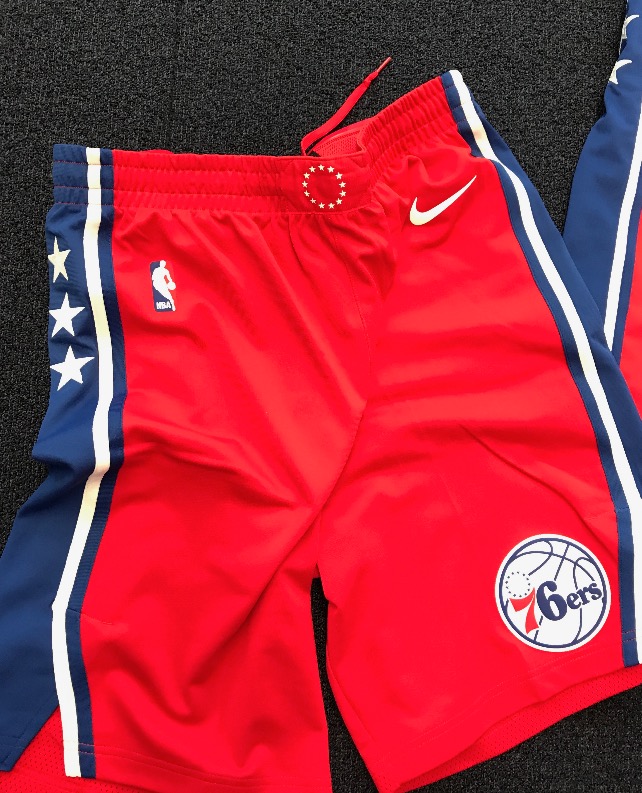

Fashion editor Dan will have some thoughts later, but, like the Sixers’ other jerseys, these look amazing and are a perfect blend of classic and modern. They are different enough to add some variety while not being as offensive as the Doug Collins era block font.
The Sixers have embraced blue as their identity color over the last few years, so the red jerseys will serve as an alternate, but one that they’ll likely wear more this year than they did last year. A new promotions schedule will outline which uniforms they will wear for which game. They will in fact wear this on Christmas, as the league has done away with the holiday specific jerseys this year in lieu of the four Nike uniforms each team will have. They will also soon show off a new court that they’ll use on Friday nights, similar to the heritage court they used on Saturdays last year, and it will be paired with a fourth uniform that will be unveiled later this year.
Well done.

Kyle Scott is the founder and editor of CrossingBroad.com. He has written for CBS Philly and Philly Voice, and been a panelist or contributor on NBC Sports Philly, FOX 29 and SNY TV, as well as a recurring guest on 97.5 The Fanatic, 94 WIP, 106.7 The Fan and other stations. He has more than 10 years experience running digital media properties and in online advertising and marketing.