
Ad Disclosure
Reviewing The Sixers’ Excellent New Red Uniforms
By Dan Fuller
Published:
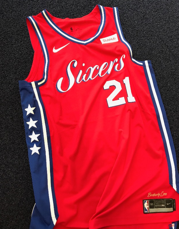
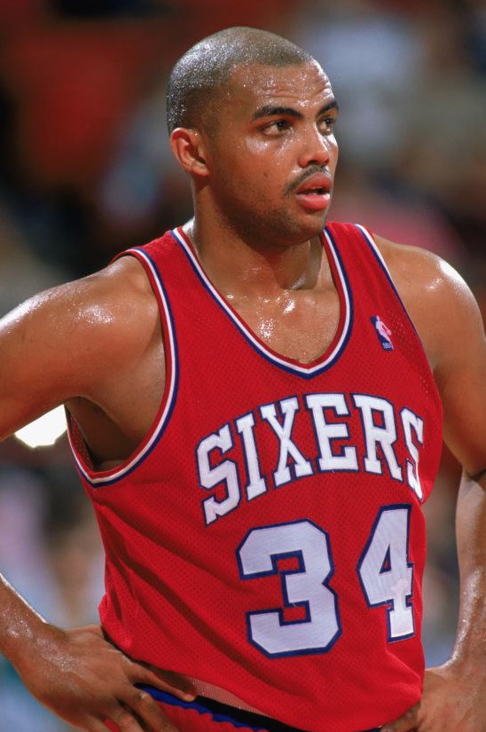
They’ve done it again. The Sixers have taken a design, which maybe wasn’t perfect but didn’t need any tweaking, and have made it better. Truly, addition by addition. Simply re-rendering the 2017 updated uniforms on a red base would have been the easy thing to do. Rather, the Sixers utilized the successful 7+6 star design and added a new, tasteful script version of the “Sixers” wordmark. It is similar to the (never worn) Sixers Christmas jersey of 2016, but that was a league-wide design template, and the 2017 typeface is unique to this application.
The subtle blue drop-shadow gives just enough pop to make the design stand-out. Prior to the 2017 drop-shadows, the numbers and text on the recent uniforms had contributed to the general “retro=dull… but they’re still nice!” feel of the jerseys. This little addition gives the entire set released so far just enough more visual impact to not look like a copy of an “old school” design, but something actually inspired by those designs. Simply executing the 2017 version of the white and blue uniforms in red would have still resulted in a “nice” uniform (maybe not the “fire in the desert” Kyle mentioned, but still a noticeable upgrade from the pre-2017 set). The Sixers, however, took a calculated risk, and it paid off.
BUT, you say the typeface looks out-of-place and maybe even a little wimpy? Well, this isn’t the first time the franchise has dropped way-out-there lettering on what’s thought of as their classic era of uniforms (70s-1991). There’s the, as Kyle calls it, “Doug Collins” era funky block lettering “Sixers” uniform, and there’s also this weirdo sitting in the archives: the 1970-71 white jersey. Woof. Cursive and a shared “S” and everything. Its picture could be in the dictionary next to the entry for “trivia.”
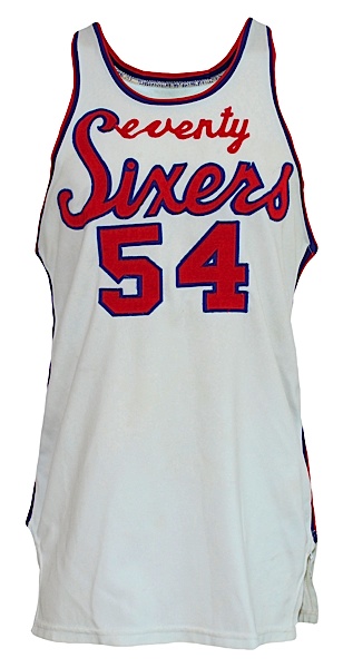
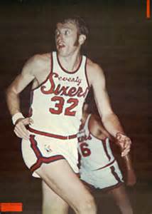
both pictures above from the awesome NASL Sixers Gallery
It’s likely not a source of inspiration, but at least we know cursive isn’t unprecedented.
So, maybe there are some things that aren’t great about this new uniform? Well, sticking to the design motif of the blue and white jerseys was nice, but even with a typeface change, I can’t help but notice “PHILA” is in all-caps on those jerseys while “Sixers” on the red jersey isn’t. Yes, this is nitpicking – I’m actively trying to find something wrong here – and all upper or lowercase cursive wouldn’t be a great look. There are some people on Twitter who have pointed out the little thing between the I and the X in Sixers, including Keith Olbermann:
New Philly Unis. Uh, guys? Between the "S" and The "X" – you've made a "U" #Suxers ht @rossingbroad and @conradburry https://t.co/Qu8C2m0n6d pic.twitter.com/H07vKKg3gT
— Keith Olbermann (@KeithOlbermann) September 13, 2017
It’s the tail of the X, and though I can see how it looks a bit out-of-place if you stare at it real hard, it generally doesn’t bother me.
Also, with the three released (of four, total) uniform designs all evoking the same general era of the team… what about the 90s? Awful 90s design is back in style big time, and even in cynical terms, the fans clambering for a Shawn Bradley-era jersey (you pick: tacky, awful, and amazing or actually pretty nice and way underrated) or even Iverson era jersey are of the age where they have the money to spend now. Even more cynically, someone with a current white jersey isn’t going to buy the blue jersey (and vice versa). Maybe they’d consider the red one, but the fourth jersey needs to be something way off the reservation, hopefully evoking something other than the same window of time the three released jerseys do. Additionally, I LOVED the contrasting red numbers on the white jerseys which were lost in the 2015 re-design. The new drop-shadow helps, but it’s just not the same. [Editor’s note: I couldn’t disagree more on this.] Finally, these uniforms would look a lot better without any ads on them, but such is 2017.
Final Verdict: My thumb is way up. No one would have guessed this was where the design was going, and it successfully underlines why the approaches of “not too different from everything else” and “let’s rock the boat, but just a little” are appreciably different. It’s another addition by addition move by Sixers uniform designers; they pulled it off in 2015 and 2017. Let’s hope for something equally exciting for 2017’s fourth uniform.
I’m also going to point out the slickness of choosing to use a tiny drop shadow on all three (so far) of this year’s jerseys instead of the stroke/outline that had been used in the later years of the “classic” design. It’s a tiny distinction, but it makes it 2017’s jersey, not 1988’s.
