
Ad Disclosure
The Wings Unveiled Their New Home Jersey
Published:
The second version of Philadelphia’s NLL professional indoor (box) lacrosse team has unveiled their new home jersey. They’re nothing like the old threads.
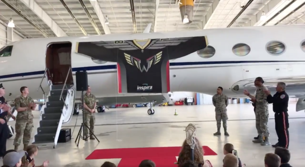
The Philadelphia Wings showed off their black home jerseys and announced their founding partner inside a hanger at the Northeast Philadelphia Airport. A weird location if you ask me, but I guess the new brand revolves around aviation.
Unveiling after the jump:
Our jersey just dropped…. (literally) pic.twitter.com/LmHRzTwJsf
— Philadelphia Wings (@NLLwings) June 12, 2018
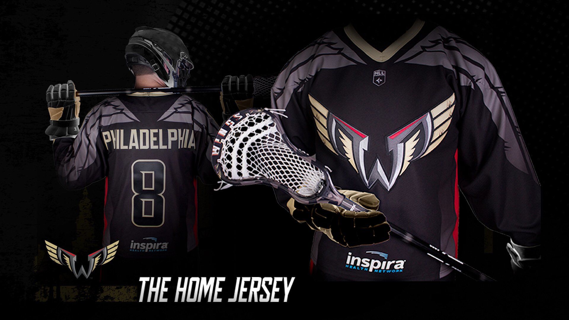
Here’s the jersey closer up:
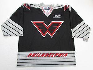
To compare, here’s the old black jersey:
Here’s their press release on the unveiling and partnership with Inspira:
We took the theme a bit too big with our airplane hanger setting, but we’d rather go big then go home while honoring local servicemen and presenting them their WINGS and the first official home jerseys for the 2018 -2019 season.
“Our partnership with Inspira is rooted in community activation and health and well-being for local youth, as well as our players,” said Shawn Tilger, Wings Governor. “This partnership ensures our athletes have the highest level of care. Inspira’s partnership is instrumental in keeping our players healthy and promoting health and wellness to our local community.”
Inspira Health Network is the preferred healthcare provider for the Philadelphia Wings and will provide healthcare services to all Wings players.
“We are excited about this partnership with the Wings and the work we will be able to do together in the community. We will work closely with the Wings to help promote health, wellness, and injury prevention amongst local youth athletes,” commented Inspira Health Network CEO, John DiAngelo.
The Wings home jersey is black with the logo crest on the front and charcoal wings draped over the shoulders to emphasis our new start. Numbers on the back of the jersey are outlined in our majestic gold. Red can be found on the inseams of the jersey to bring a bit of boldness to this tough jersey.
“This home uniform representatives a new era in Wings lacrosse,” said Lindsey Masciangelo, Executive Director of Business Operations. “The uniform has a touch of history in it with the red color and our W in the logo, but uses our gold and charcoal to represent our new look.”
When the logo was unveiled back in November, Kevin wanted to see the new logo on a jersey before making a decision. I’m interested in what he thinks of it now.
Personally, I think the jerseys look sharp. I thought maybe the gold would’ve ruined it a little bit, but they did a good job not using a ton of it on it. The charcoal grey on the shoulders remind me of the old logo. I think the only bad part about it is the sponsorship on the front. Maybe just the back would’ve been a better idea.
Eager to see what the white away jersey looks like, and I hope they decide to do a throwback alternate jersey as well.

Chris is the Morning Roundup writer on Crossing Broad. He recently graduated from Syracuse University and was the video coordinator for the men's lacrosse team. He's previously covered the Philadelphia Eagles for Philadelphia Magazine’s Birds 24/7 and KYW Newsradio 1060. Chris is also a Production Assistant at ESPN and the Managing Editor for the college lacrosse website College Crosse.