
Ad Disclosure
Temple Unveils New Athletics Logo
By Kyle Pagan
Published:
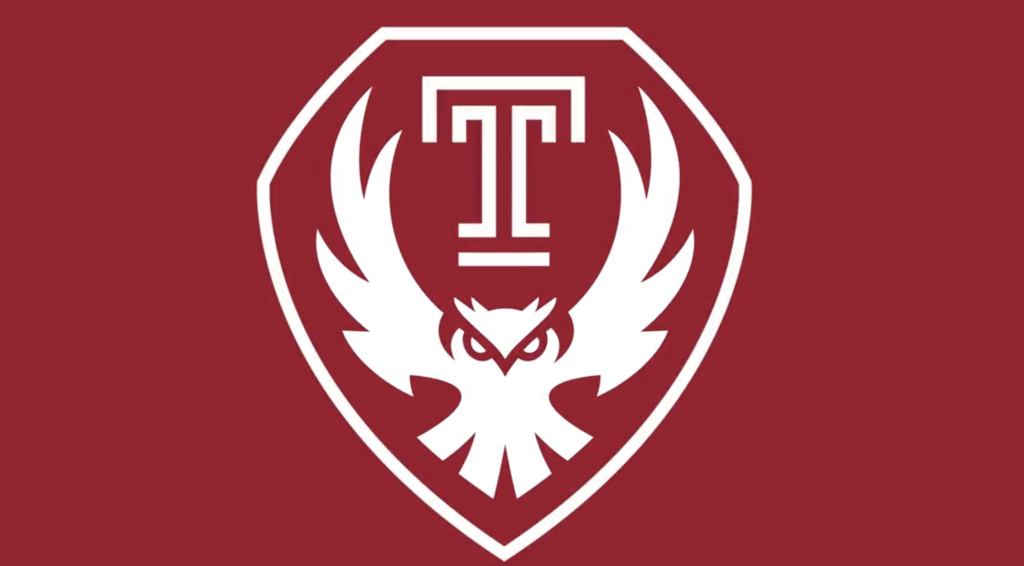
Unless you’ve been living under a rock, you know Temple released their new logo on Tuesday. I can’t believe the Cherry & White cucked the Kelly & Green.
Created by Owls, for Owls. Today, we’re excited to announce the new Owl Mark! pic.twitter.com/xqxckQEmWY
— Temple University (@TempleUniv) August 1, 2023
Anyone that’s designed a logo nowadays knows it’s all about sharp angles, bold lines, and fierce looking animals. Look at some of the greatest logos of all time. The Nike swoosh? Sharp angles. McDonalds? Bold lines. Wawa? Fierce bird. This is right out of the logo playbook. This logo would peck the eyeballs out of a Wildcat and leave them to die then come back later to pick apart their flesh. This logo just covered against Rutgers IN New Brunswick next month!
Now I understand people’s love for the 90s logos and the cartoon owl. It’s the most recognizable one in the school’s history:
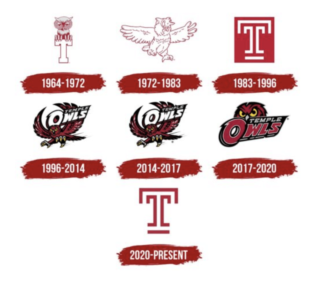
It’s an era where Temple did all their winning in basketball, and as we all know, Temple is a basketball school. But sometimes you got to switch it up. I love the Owl logo too and there is still a ton of merch I can get with it if I want. But the hate feels like when everyone got fired up over the new Eagles wordmark last year? We grew to like it. Just like Temple fans will grow to like this when we’re in the Big 12. It’s already the third best logo right now behind the Longhorn and Kansas State and will be number two when Texas moves to the SEC.
/cdn.vox-cdn.com/uploads/chorus_image/image/65607011/Big12.0.png)
Plus, I think I like the secondary logo even more. I think it would look sick on the football helmets:
New Temple merch available at the bookstore! What are your thoughts! GO OWLS! pic.twitter.com/Amxhvwewn3
— Katie Colbridge Ganzelli (@katiecolbridge) August 1, 2023
Here’s the process behind how they came up with it:

Just remember it could always be worse:
P.S. Anyone catch what happened in 2014 in that photo of Temple’s logo history earlier in the blog? Did the bird shed some feathers or something or am I looking at the same exact logo from ’96-14 and ’14-’17?

Kyle writes blog posts and does Man on the Street-style videos all around Philadelphia. He graduated from Temple University (a basketball school) in 2015. contact: k.pagan@sportradar.com