
Ad Disclosure
Union Reveal Jerseys That Don’t Say BIMBO Across the Front

By Matt Schultz
Published:

I’ve written about jerseys once today and twice in the last week and I am not done yet. Maybe this will be my beat on this website now. The shirts blogger. Matt Shirts. Sounds similar to my name, which is interesting. This is something to think about.
In any event, the Union unveiled new kits on Thursday:
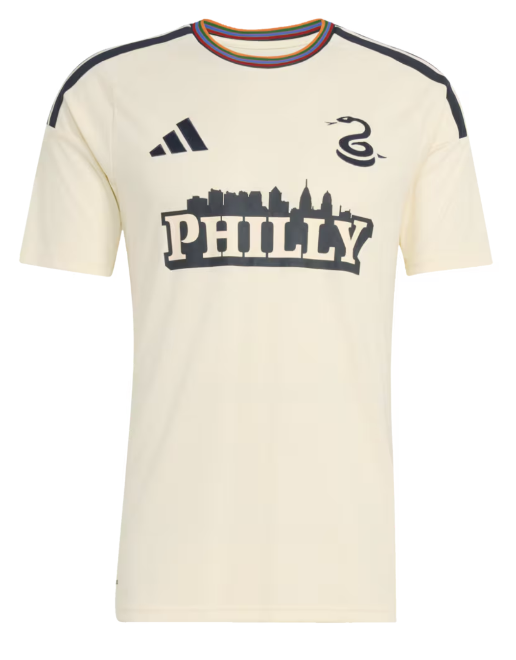
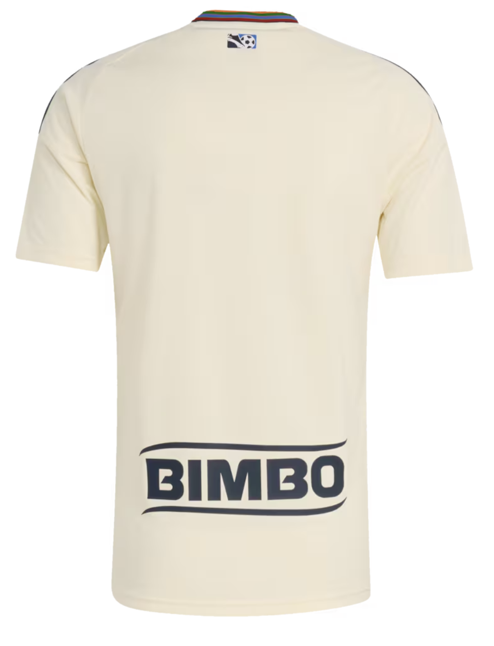
These… are pretty sick. I like these a lot. And I’m pumped about that. Really glad these look cool. I’m not a huge fan of the Union’s other jerseys, and when I saw they released some new ones today, I feared I’d have to do another negative uniform blog. I don’t want to be the blogger who shits on shirts. I want to use this platform to celebrate shirts. So I’m very relieved that pretty much everything about these uniforms rules: the cream. The multi-colored collar. The stripes on the shoulders. The snake and the Adidas logo on opposite sides there. The throwback MLS logo on the back. All of that is A+ in my opinion. Really good stuff.
I should say, though, in the spirit of transparency, I did slightly bump on the “Philly” font at first. Luke said in the Crossing Broad Slack that the “Philly” looks like a default Canva font. At first glance, this felt true. I agreed. But then I stared at the jerseys for another five to ten minutes and the font kind of grew on me.
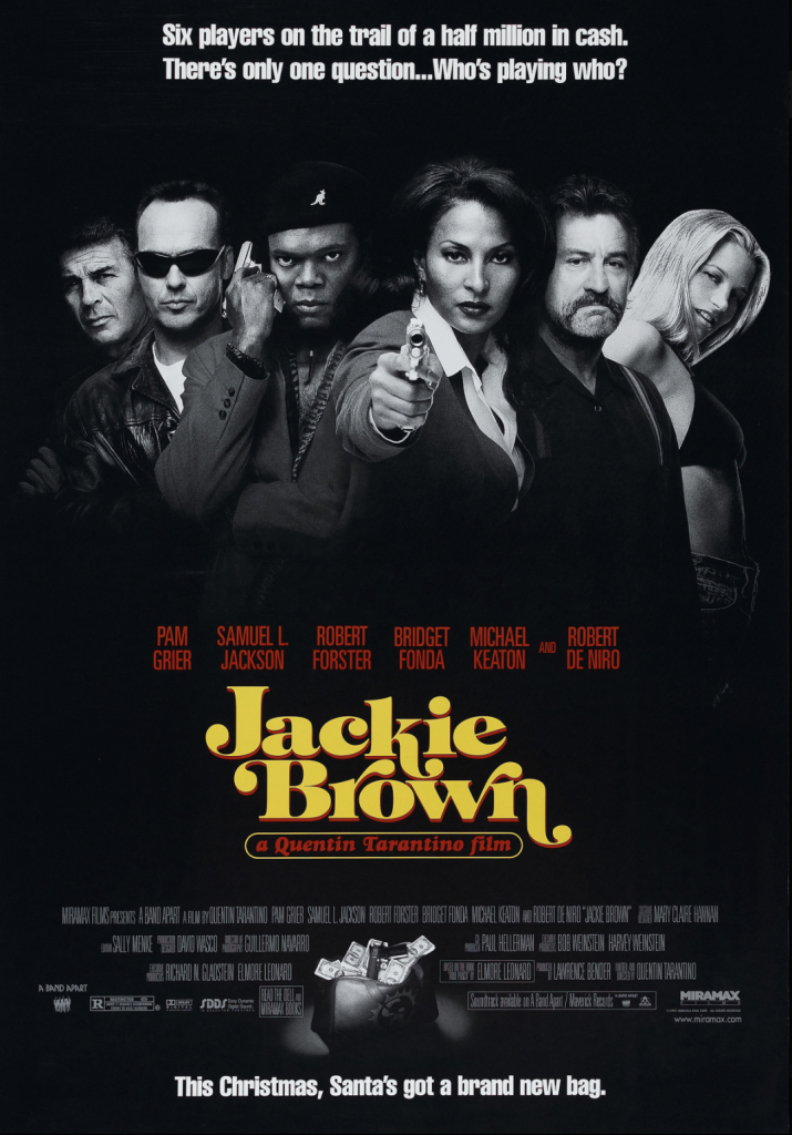
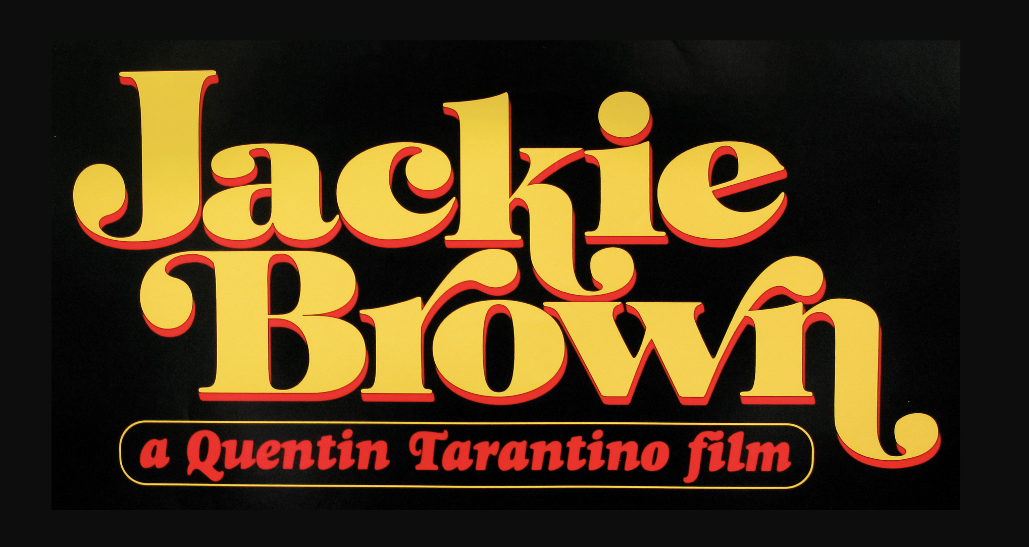
I’m not saying it’s my favorite. I’m not nuts about it. But I can kind of appreciate what they’re going for. The press release talks a lot about how the design was inspired by Philly sports history, and with that in mind, I can squint and kind of see a 70s-ish font. I’m picturing the font from the Jackie Brown poster, which I think the 70s Eagles and Sixers fonts had a little of:
The skyline in the logo is alright. It’s fine. They omitted the Comcast buildings, which I guess was a throwback choice to stay on-theme. Probably a good choice. The classic Philly skyline looks cooler anyway, with Liberty Place being the tallest/most prominent building.
Also, the new jerseys don’t say BIMBO* across the whole front. That alone is a win. Well done, Union. If you send me a jersey I’ll gladly wear it. To have the shirts blogger wear a Union shirt could be a pretty big deal. Something to consider.
Kinkead: Union and BIMBO should part ways after the shirt deal expires because BIMBO moved their American HQ from Horsham to Dallas
Matt Schultz is a comedy and sports writer from Philadelphia. He’s written extensively for ClickHole, The Onion, and Conan O’Brien’s Team Coco. His work has been featured in Vulture, Deadspin, The A.V. Club, Paste Magazine, and other publications. Much of his sports journalism can be found on college basketball websites that don’t exist anymore (PhilaHoops Heads rise up…) email: M.Schultz@sportradar.com