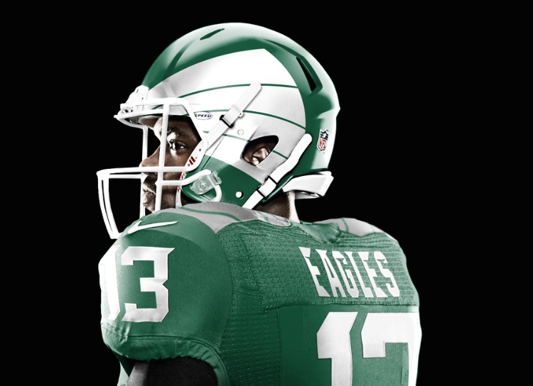
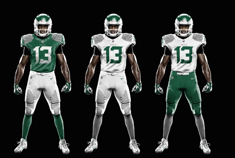
It’ll be Nike’s job whenever it happens. But for now, one graphic designer, Jesse Alkire, has taken it upon herself to mock up some concepts*, and the results are pretty outstanding:
I don’t like the shape of the wings– they’re too Oregon. The colors– too Michigan State. But this is a really good start.
Alkire explains:
A lighter, more nimble look for the Eagles leaves behind the often clunky and heavy mix of dark green and black. Silver shoulders feature stitching representative of wings. An aerodynamic custom letter and number type, with strong edges and points reminiscent of an eagle’s tapered feathers.
Good stuff. Modern, not too ridiculous, almost Kelly Green.
See the rest of Alkire’s NFL concepts here.
*Logo and uniform concepts have become the hipster thing on the webzzzzzzz. All good for now, but we’re one “NBA logos as K-Cup lids” portfolio away from them jumping the shark.
via (@TheMightyEROCK)