
Ad Disclosure
Grading the America 250 Phillies Jerseys and Hats
By Matt Schultz
Published:
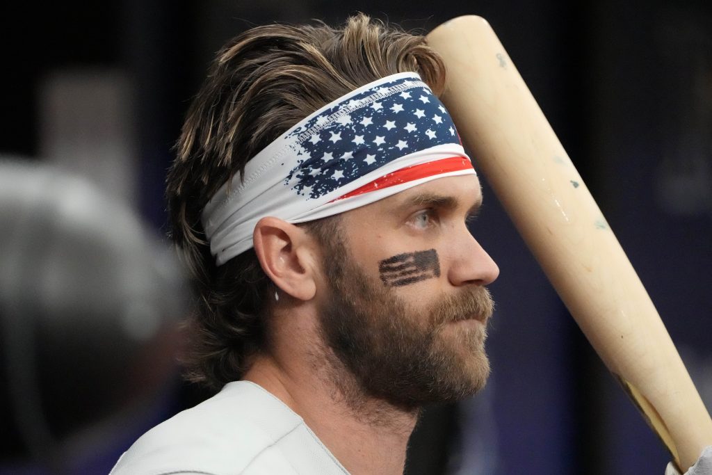
The Phillies’ Fourth of July jerseys and hats have been revealed, and with America 250 celebrations making this Independence Day extra noteworthy, MLB took some pretty big swings with the design:
Here’s how we’re going to do this. First, I’m going to present you with some takes from around the internet. Then I will tell you what the actual, correct verdict on this merch is (what I think).
From Around the Internet
If they were only wearing the cream uniforms pic.twitter.com/fYBYbg0xFe
— Beautiful Dogs (@SBCHAMPS_18_25) June 15, 2026
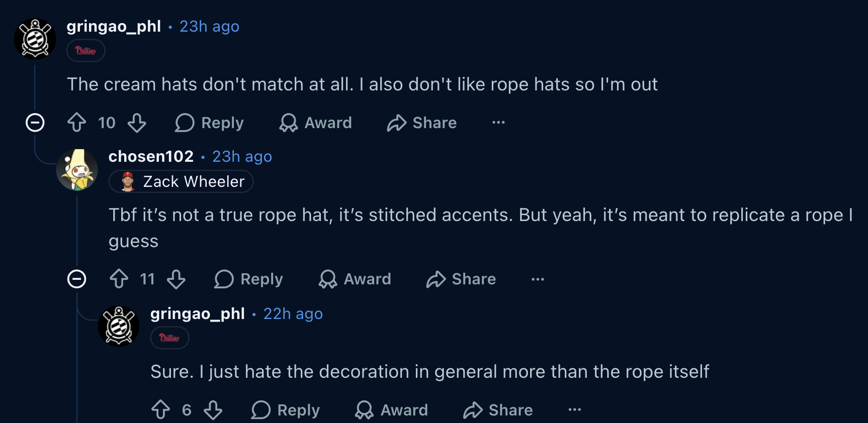
The stripe where the hat meets the brim is a bit much. Wasn’t needed.
— VonHayes (@VonHayes1982) June 15, 2026
Bummed because I loved last years hat but this one’s a bit too on the nose especially with the side patch
— Nick 🦜 (@BirdTalksBall) June 15, 2026
Ugly as fuck. sorry not sorry. The bands look poorly done, and the color is just blech, it looks more cream than white. looks like someone bought it off temu.
— JT (@JTProductions2) June 15, 2026
Looks fine but they'll be wearing the gray uniforms which is a terrible mismatch
— ≼ꂵꉓꁅ≽ (@clutchkilroy) June 15, 2026
Even on one of the few teams where the red white and blue doesn’t clash, it still looks really bad.
— taylor (@TJenkinsTampa) June 15, 2026


The Correct Opinion (mine)
Everyone online is weird as hell. They’re wrong on this. People on the internet just love shitting on stuff. No one ever looks at something and just says, “Pretty cool. Nice.” Except me. That’s what I’m doing. I think these jerseys are good. I genuinely like them. More specifically:
-The American flag design inside the numbers is cool. Very different. I’ve never seen it before, and that’s a plus.
-The ribbon along the brim of the hat is great. Everyone online is saying it’s trying to be like a rope hat, and I completely disagree. To me, it feels more like a merch design you would’ve seen for the bicentennial celebration in 1976. It looks like those American-striped tube socks 70s people used to wear. Makes me think of Dazed and Confused. Has a retro feel to it, in my opinion. I like it.
-I like the gold outline around the ‘P’ on the hat. Very regal.
-Everyone whining about how the gray road jerseys don’t match the cream hats is wrong. This will look cool. It’s different. I’ve never seen the road grays with a cream hat. It’s fun to see different stuff sometimes.
-The America 250 patch on the sleeve and side of the cap is fine. I’m not crazy about it, it’s probably the thing I’m least excited about here, but it’s alright. How much better could the patch be? Most patches don’t look that great. The ceiling for a patch is “solid,” and that’s what this one is.
All that being said, it’s finally time to announce my final grade…
Which is…
an A-
Well done, MLB. Don’t listen to the internet. You did a good job. Please send me some of this merch for free. I went to bat for you here. I sang for my supper…

Matt Schultz is a comedy and sports writer from Philadelphia. He’s written extensively for ClickHole, The Onion, and Conan O’Brien’s Team Coco. His work has been featured in Vulture, Deadspin, The A.V. Club, Paste Magazine, and other publications. Much of his sports journalism can be found on college basketball websites that don’t exist anymore (PhilaHoops Heads rise up…) email: M.Schultz@sportradar.com