
Ad Disclosure
UPDATE: Is This a Preliminary Design for Kelly Green Eagles Jerseys?
By Kyle Scott
Published:

UPDATE: Our Eagles Insider (not Dave Spadaro) thinks this is a fake, noting:
“A full revert to Kelly Green will never happen as long as Christina Lurie still has a presence within the organization. She despises that look, and her involvement with the team on the apparel side has always been leaps and bounds above Jeffrey’s. She may not be in front of the cameras anymore, but she’s still a business partner within the organization. Her power has dropped off post-divorce, but she’s still above Mike Michelson and Richard Green from a decision making standpoint (2 men who own a small share of the team).”
They added that the Kelly Green third jersey is a real possibility, but that weird NFL helmet rule remains a hurdle.
…
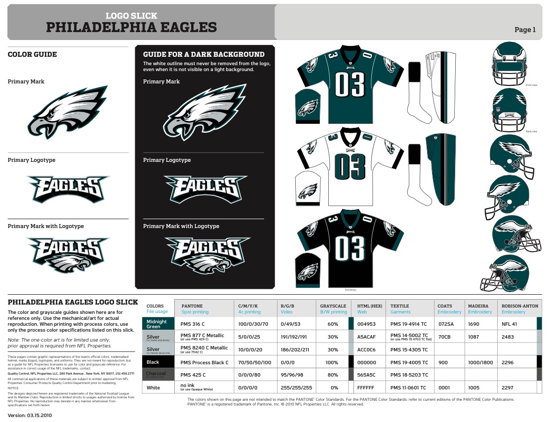
A tipster sent us this screenshot today, which was purportedly taken by an Eagles employee of what appears to be the logo slick for a very early version of a proposed uniform update.
We have no idea what to make of it.
There are many concepts floating around for what Nike could do with the Eagles’ uniforms, and this one has never been seen before (by us, anyway). The picture, of a computer running Adobe Illustrator, shows an Eagles logo slick for a Kelly Green uniform update, complete with wild-ass third jersey. It is in fact in the same style as other logo slicks, which lends some credibility to it. The timestamp – Version 09.30.2014 – makes it current, but the address for NFL headquarters is old (they moved from 280 Park Ave to 345 Park Ave in 2012) and the copyright date of 2010 gives us pause. The publicly available Eagles logo slick does, however, have both the older address and 2010 copyright, so it’s possible this was derived from that template… or is a fake.
A couple of months ago, Don Smolenski told the WIP Morning Show that the Eagles were toying with a switch back to Kelly Green. Later that day, however, the Eagles walked it back and said they were only considering the color for a third jersey (of course, it’s possible they didn’t want an Osborne effect and to cannibalize current jersey sales). But a weird league rule makes only a third jersey in Kelly Green difficult.
So where does that leave us with this design?
In a follow-up email, the tipster claimed it’s one of a few very preliminary designs, and the chances of it becoming the final product are slim, like a concept car. But this is the first concept that (again, purportedly) comes from the Eagles. And it’s in Kelly Green.
As for its legitmacy: The numbers used on the jerseys and other details are the same as the Eagles’ previous logo slick, which means it would’ve been quite easy to change color fills and call it a day (the green Eagles logotype is hideous). However, the color chart is updated with all new color names, PANTONES, and even new language regarding HTML and web-safe colors. If this is a fake, it wasn’t derived completely from the Eagles’ 2010 style guide without some very specific changes to obscure language.
We can’t be sure if this is real. But if it is (and after three of us looked at it for three hours, we kind of think it is), it means the Eagles are at least considering a switch back to Kelly Green. Switching solely the colors and keeping the logo otherwise the same would make sense since the current regime has so much invested in that design. A third jersey is where there’s more room for experimentation. I would think, however, that there would be at least be some pattern refresh on the green and white jerseys if they did switch colors. It’s also interesting to note that the silver color here has been changed from two types of “metallic silver” to “grey.” As fashion editor Dan has written, Nike struggles with that whole metallic thing.
Anyone know anything about this? If you do, we want to hear from you. Anonymity assured.

Kyle Scott is the founder and editor of CrossingBroad.com. He has written for CBS Philly and Philly Voice, and been a panelist or contributor on NBC Sports Philly, FOX 29 and SNY TV, as well as a recurring guest on 97.5 The Fanatic, 94 WIP, 106.7 The Fan and other stations. He has more than 10 years experience running digital media properties and in online advertising and marketing.