
Ad Disclosure
The Flyers’ 50th Anniversary Jerseys Look Just Horrible on the Ice
By Kyle Scott
Published:
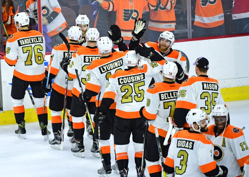
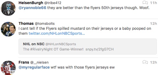
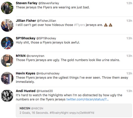
Hey the Flyers won last night in overtime of a game that six people watched. I saw a highlight of the winning goal and reflexively vommed myself upon the sight of the green numbers on the jerseys.
How do the Flyers, a professional sports team, not think of this? How do they not consider how goooooooooooooold surrounded by white will show up under incredibly bright TV lights, especially at the Wells Fargo Center, and look on TV? I sell $25 t-shirts and learned that lighting makes a huge difference on how something actually looks by, like, my second shirt. Nike had this problem recreating the Eagles’ Midnight Green because they were trying to match a reflective color on a matte surface to a reflective color on a reflective surface (helmets), which is why the Eagles look like canonical Ninja Turtles in their home jerseys. But at least Nike and the Eagles were aware of the problem. I honest to God think someone in the Flyers’ marketing department picked a shade of gold and just rolled with it. Because how the hell else do you wind up with such a mismatch from the intended color?
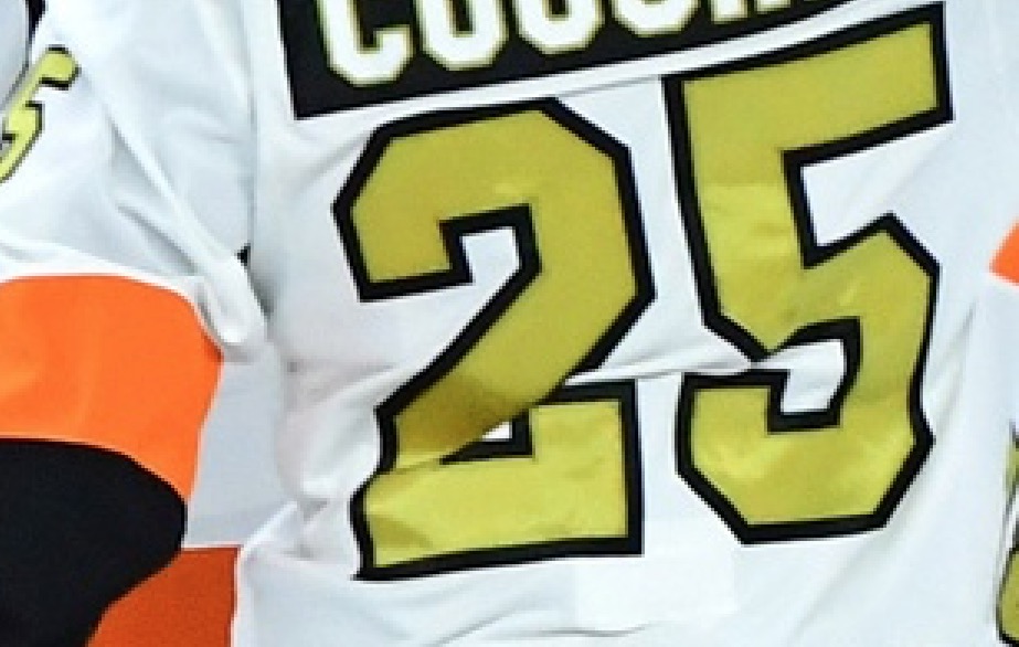
Note that the oranges are very similar, so this isn’t a white balance issue– it’s how the jerseys actually look on the ice.
These jerseys are embarrassing. They’re not good to begin with, but I can at least understand why they exist and why you might want to buy one. But in practice they’re a TOTAL DISASTER. Donald Trump’s hair has a more natural luster. In fact, even he looks at them and is like “Yo guys, maybe tone it down on the gold until you can get the color right.” Sad!

Kyle Scott is the founder and editor of CrossingBroad.com. He has written for CBS Philly and Philly Voice, and been a panelist or contributor on NBC Sports Philly, FOX 29 and SNY TV, as well as a recurring guest on 97.5 The Fanatic, 94 WIP, 106.7 The Fan and other stations. He has more than 10 years experience running digital media properties and in online advertising and marketing.