
Ad Disclosure
Eagles 2010 Uniform Round-Up – The 1960 Throwback
By Dan Fuller
Published:
It's that time of year – the notable roster additions and subtractions have been discussed, the expected win-loss record has been decided, the newly featured players have had a chance to step up, and the Cowboys fans have been thoroughly bashed. What's left? Well, three interminable pre-season "games," and lengthy discussions of uniforms.
We'll be taking a hard look at the Eagles 2010 uniform situation today, then running a week-by-week season preview showcasing each expected match-up. (the NFL doesn't have hard and fast "home" and "away" uniform designations like baseball, so there will be some guessing)
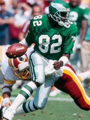
The biggest uniform news this season by far is the addition of the 1960 Kelly Green over White Throwback to be worn for 2 (or 3?) games. Though most fans (this one included) have generally positive opinions of the current "Midnight Green" uniform sets, others clamor for a return to the Kelly Green, which had been the primary color used from 1948 (or prior?) to 1995. "They should wear the Cunningham-era jerseys again" was the typical comment, and I think that most people lump all of the Kelly Green designs together (they look almost the same from the beginning to the last ones in 1995), and, well, the Cunningham "era" is the most convenient point of reference for the "old school" look, if only because the Eagles weren't a particularly great team during his 1987-1994 run, and the McNabb era is associated with the Midnight Green, though it predates him by three seasons.
Of course, the "reason" (beyond additional merchandise revenue — yes, people even bought the yellow and blue monstrosities from 2007) for the throwbacks is to celebrate the 1960 season, so much of the discussion of "this other Kelly Green design would have been better" is rather moot, but words and opinions are free on the Internet, so here comes the soapbox. Keep in mind this is not a discussion of the authenticity of the throwbacks or how close they got to the classic look; this is all about the look itself.
Simply, the 1960 throwbacks are boring. Not because they're "old," not because they're "classicly simple," but because they're brutally plain. Look at what the Packers and 49ers can do with the "classic" NFL template. I don't need the modern busy-ness of the Bengals, the Bills, or the Broncos, but the jersey is literally just green with white front/back numbers and TV numbers (what numbers on the sleeves are called). No stripes, no trim, no stroke around the numbers, heck no logo (the Reebok logo doesn't count) or even Eagles wordmark. Sure, they're authentic, but they're boring, too. [I don't think the current uniforms are perfect either; see my comments in future articles.] Come to think of it, the vaunted "Cunningham-era" jerseys aren't all that great either; very, very plain, but at least they added an Eagles logo to the sleeves and black stroke around the numbers (on both the green and white jerseys) adds something to it.
The pants and socks are an improvement, with two green strips along the outseam of the white pants, a white belt, then a ~50/50 ratio of white sanitaries over green socks, with a slim white band on the green socks to visually "break" the verdant field. (triple word score!).
Unfortunately, in the interest of authenticity, the wing detail on the helmet is plain silver. It lacks both the simple white stroke of the "Cunningham-era" helmets and the more complicated black and white inner and outer stroke of today's helmets (which also include an arguably excessive silver highlight color to give more definition to the "feathers").
Ignoring the significance of the 50th anniversary, what were some other, maybe more visually interesting options?
Well, the 2nd most of thought of (in my incredibly unscientific poll of one) Kelly Green uniforms are those funky ones from 1969-1973 with a white helmet with green wings. (even funkier in 1973 when they had a black stroke around the green wing). Then there are those "wasn't disco bad enough" late 70s-early 80s disasters. Or as I call them Stripezilla 1 and Stripezilla 2, Stripezilla's Revenge. Or, they could've done something practically sacrilegious and just replaced Midnight Green on the current uniforms with Kelly Green and swapped in the silver pants of the "Cunningham-era" (file by Jeff Shirley from a uniwatchblog.com uniform tweak round-up).
Look for future articles about uniforms as the season approaches, then a weekly uniform-centric overview of each upcoming game. Until then, enjoy the Eagles in their white over white combo, a look which is unique to their pre-season games.
